My Page Title
Overview
Your class project involves assembling components of webpages in service of creating a website. To meet those ends, you will be wrangling data and writing code scripts that will reproduce visualizations when data are updated at different time periods (e.g., months, quarters, etc.). Those figure will also need to be embedded into a webpage for display. After this exercise, you should be well equipped to make progress on building pages for your website and adding relevant content to your pages.
What you will need
- data:
"ht-cleaned.csv" - a plot saving
.Rfunction script (previous assignment) for saving your plot - a
.Rscript for building a plot to replicate a visualization - a
.qmdfile (this file) what will be rendered into anHTMLfile for the webpage
What you will need to do
- within your
.Rplotting script:- create a script (e.g.,
beavis_stag_ht_chamionship.R) for building a plot that replicates this plot - read the data:
readr::read_csv("https://raw.githubusercontent.com/slicesofdata/dataviz25/main/data/tfrrs/ht-cleaned.csv") - utilize the plot-saving function that you created earlier in order to save your plot as a
.pngfile named meaningfully and ensuring that you save it to afigs/directory (needed for the embed)
- create a script (e.g.,
- within this
.qmdfile:- call/execute (e.g., source) all relevant scripts needed for your workflow in the designated quarto code block (absolutely no code in code blocks except for calling scripts)
- embed your
.pngplot file to be embedded in the webpage - remove all homework related text from this
.qmdfile so that the contents do not read as a homework assignment - add/modify any other text content you believe would be useful
A .qmd file
A Quarto Markdown file (this file) is used to build HTML files. Like .Rmd files, it contains text and code blocks but offers additional flexibility to RMarkdown files. This file alone does not create a website but represents a page that would appear on the designed website.
Data and Plot
Feel free to collaborate. Consider the following description of the data to help.
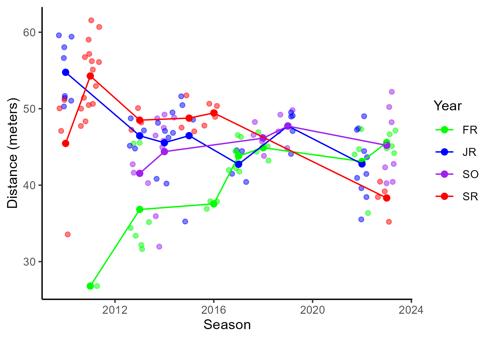
The plot shows throwing distances at championship events for Stags of different class ranks and across seasons. For championship events only, Stag throwing distances naturally vary. Mean hammer-throwing distance for senior Stags, however, appears to be on the decline, especially when compared with freshman Stags.
Look at the data frame and study the plot to determine how you might replicate it and do so as best as you are able.
- You will notice that the legend keys are in alphabetical order, which seems odd for a plot but that’s something we will address in later topics. However, you will want to ensure that the class rank and the colors would remain consistent, for example, if a plot did not include a sub group (e.g., seniors were dropped out), the colors for class ranks will be the same across the plots.
- The colors are selected not for aesthetics but to make this easier for you to replicate.
geom_line()is added to facilitate; though we have not usedgeom_line()explicitly, you should be able to figure out how to use the function because it works a lot likegeom_point()- be mindful of addressing overplotting in a way that affords plot replication
- consider controlling spatial position in a way that would least likely bias the actual data/the identity position; this involves paying attention to axes when adjusting spatial position
Stag Hammer Throwing at Championship Events
Blah blah …

Upload your .qmd file to: here