source(here::here("r", "my_functions.R"))Multi-panel plots: Faceting
Under construction.
This page is a work in progress and may contain areas that need more detail or that required syntactical, grammatical, and typographical changes. If you find some part requiring some editing, please let me know so I can fix it for you.
Overview
When you map variables to aesthetics, you get legends. Legends are certainly helpful but legends cannot remove the plot clutter associated with many subgroups of data corresponding to those levels in the legend. Sometimes, you want to plot individual plots for various subgroups (e.g., each state, student, year, etc.) rather than map a variable containing those subgroups to a plot aesthetic. This is where we create, small multiples, or small versions of the same plot for each subgroup which are then combined into a grid arrangement (e.g., rows, columns). The advantage is that the plots are easier to process. A disadvantage comes with making comparisons across the individual plots when they are not on aligned scales. For example, comparing data on the y-axis is fairly easy to do when plots are arranged in a row (e.g., compare the height position of bars) but when plots are arranged in a column, this comparison is complicated. Heights of bars cannot be compared but instead the length of the bars need to be extracted for comparison. When plots of interest are arranged diagonally, comparing data on either x or y axis is more demanding. This cognitive process is more demanding, thus errors of interpretation can be made. This outcome is a consequence of plots composed small multiples. Nevertheless, lots of individual data can be presented using small multiples and general pattern matching or mismatching processes can be performed quite easily.
To Do
Readings
Reading should take place in two parts:
- Prior to class, the goal should be to familiarize yourself and bring questions to class. The readings from TFDV are conceptual and should facilitate readings from EGDA for code implementation.
- After class, the goal of reading should be to understand and implement code functions as well as support your understanding and help your troubleshooting of problems.
Before Class: First, read to familiarize yourself with the concepts rather than master them. Understand why one would want to visualize data in a particular way and also understand some of the functionality of {ggplot2}. I will assume that you attend class with some level of basic understanding of concepts.
Class: In class, some functions and concepts will be introduced and we will practice implementing {ggplot2} code. On occasion, there will be an assessment involving code identification, correction, explanation, etc. of concepts addressed in previous modules and perhaps some conceptual elements from this week’s readings.
After Class: After having some hands-on experience with coding in class, homework assignments will involve writing your own code to address some problem. These problems will be more complex, will involving problem solving, and may be open ended. This is where the second pass at reading with come in for you to reference when writing your code. The module content presented below is designed to offer you some assistance working through various coding problems but may not always suffice as a replacement for the readings from Wickham, Navarro, & Pedersen (under revision). ggplot2: Elegant Graphics for Data Analysis (3e).
External Functions
Provided in class:
view_html(): for viewing data frames in html format, from /r/my_functions.R
You can use this in your own work space but I am having a challenge rendering this of the website, so I’ll default to print() on occasion.
Libraries
- {dplyr} 1.1.2: for selecting, filtering, and mutating
- {forcats} 1.0.0: for creating and ordering factors
- {magrittr} 2.0.3: for code clarity and piping data frame objects
- {ggplot2} 3.4.3: for plotting
Loading Libraries
library(dplyr)
Attaching package: 'dplyr'The following objects are masked from 'package:stats':
filter, lagThe following objects are masked from 'package:base':
intersect, setdiff, setequal, unionlibrary(magrittr)
library(ggplot2)
library(forcats)Small Multiples, Faceting, and Multiple Panels
We will create a base plot for passing to facet layers.
(base_plot <- DATA |>
  ggplot(mapping = aes(x = Rank,
                       y = Score,
                       col = Team
                       )) +
  geom_point(position = position_jitter()) +
  geom_smooth(mapping = aes(col = Team),
              method = "lm",
              fullrange = T
              ) +
  theme(legend.position = "none")
)
`geom_smooth()` using formula = 'y ~ x'Warning: Removed 110 rows containing non-finite values (`stat_smooth()`).Warning: Removed 110 rows containing missing values (`geom_point()`).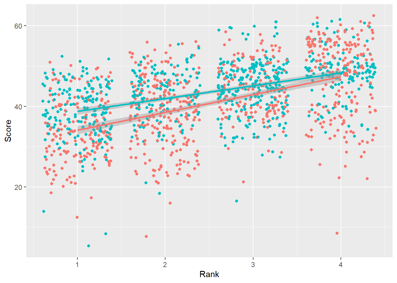
Creating facets using facet_wrap()
We see an overall pattern in the data. We can see a pattern for the Team subgroups across Rank.
We can add a facet_wrap() layer in order to plot the teams separately.
base_plot +
  facet_wrap(facets = ~Team)
`geom_smooth()` using formula = 'y ~ x'Warning: Removed 110 rows containing non-finite values (`stat_smooth()`).Warning: Removed 110 rows containing missing values (`geom_point()`).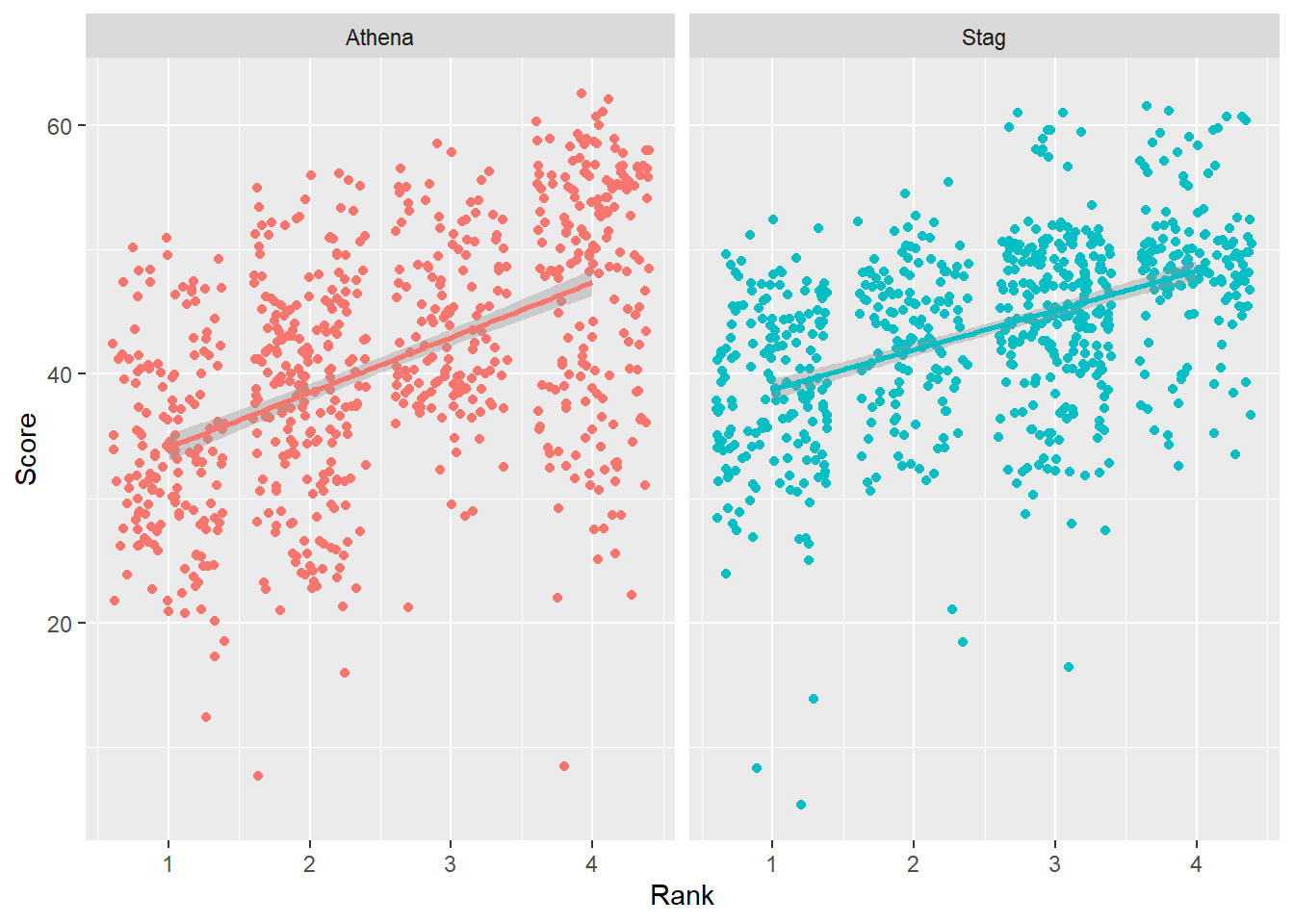
We can add a facet_wrap() layer in order to plot separately per year.
base_plot +
  facet_wrap(facets = ~Year)
`geom_smooth()` using formula = 'y ~ x'Warning: Removed 110 rows containing non-finite values (`stat_smooth()`).Warning: Removed 110 rows containing missing values (`geom_point()`).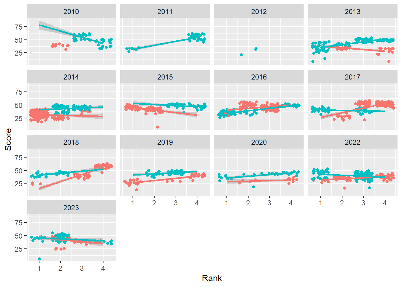
Creating facets using facet_wrap(facets = vars())
Use vars() instead of ~ to specify the variable.
base_plot +
  facet_wrap(facets = vars(Year))
`geom_smooth()` using formula = 'y ~ x'Warning: Removed 110 rows containing non-finite values (`stat_smooth()`).Warning: Removed 110 rows containing missing values (`geom_point()`).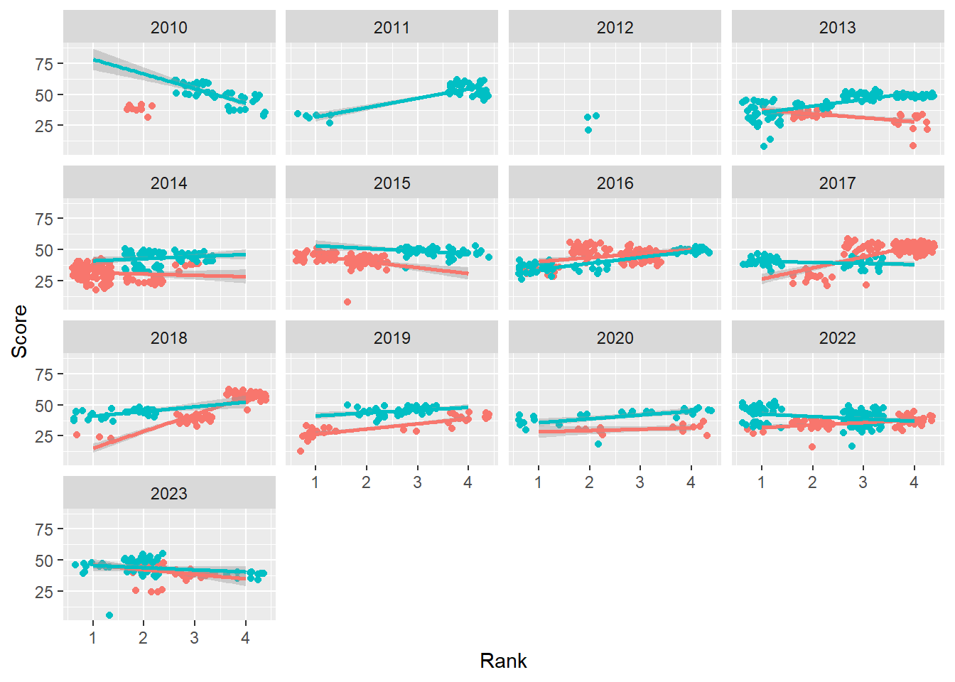
Passing two variables to vars() will create subplots for each.
base_plot +
  facet_wrap(facets = vars(Year, Team))
`geom_smooth()` using formula = 'y ~ x'Warning: Removed 110 rows containing non-finite values (`stat_smooth()`).Warning: Removed 110 rows containing missing values (`geom_point()`).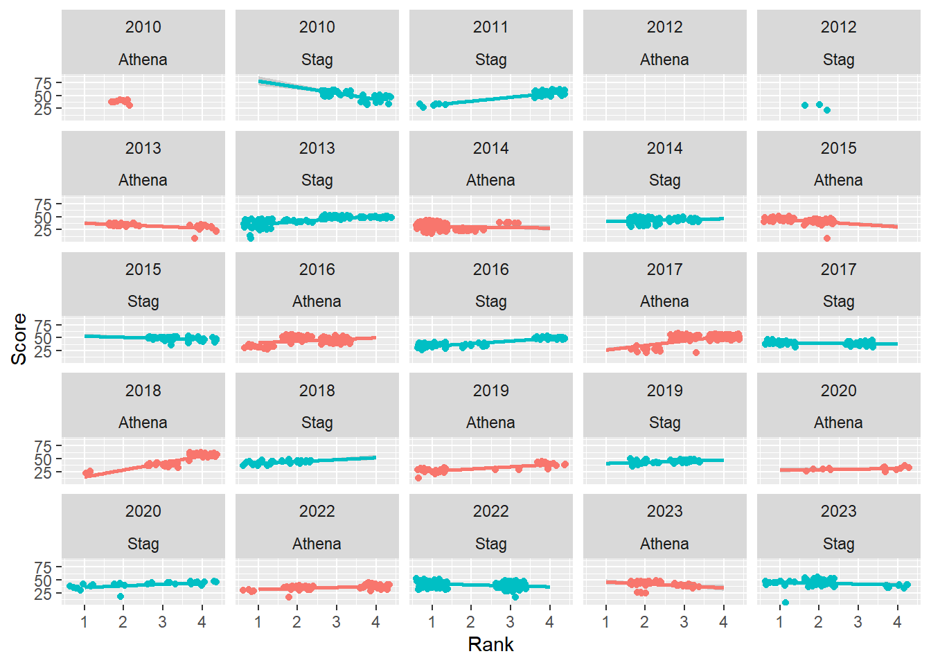
Controlling columns
Control the number of columns by setting ncol.
base_plot +
  facet_wrap(facets = vars(Year),
             ncol = 3
             )
`geom_smooth()` using formula = 'y ~ x'Warning: Removed 110 rows containing non-finite values (`stat_smooth()`).Warning: Removed 110 rows containing missing values (`geom_point()`).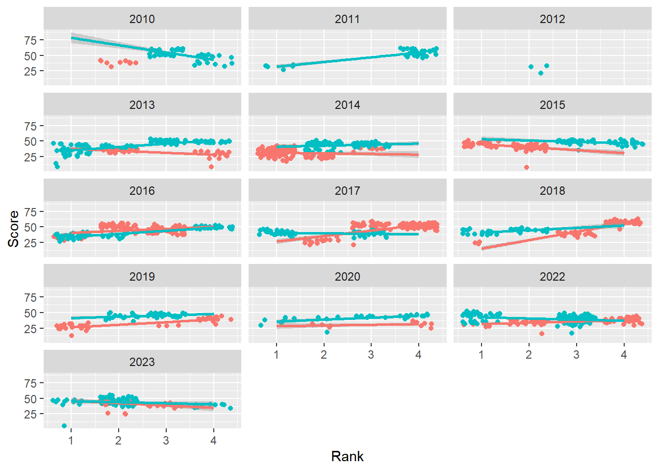
Controlling direction of arrangement
Change the direction using dir. By default, dir = "h for a horizontal arrangement. The faceted variable changes from left to right, and top to bottom. Change to dir = "v".
base_plot +
  facet_wrap(facets = vars(Year),
             ncol = 3,
             dir = "v"
             )
`geom_smooth()` using formula = 'y ~ x'Warning: Removed 110 rows containing non-finite values (`stat_smooth()`).Warning: Removed 110 rows containing missing values (`geom_point()`).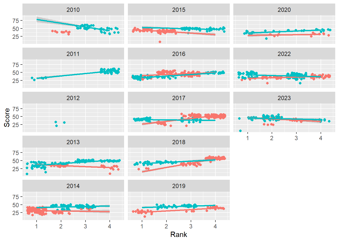
The faceted variable now changes from top to bottom, left to right. The arrangement may depend on your goals or how your audience will make comparisons.
Controlling the scales
Speaking of comparisons being made, when the range of values for variables varies by facet level, you may wish to constrain the scales or allow them to vary. By default, scales = "fixed" but you can change to move freely for x, y, or both x and y. Scales
scales = "fixed": fix both x and y scales (default) scales = "free_x": x can vary freely, fix y scales = "free_y": y can vary freely, fix x scales = "free": x and y can vary freely
Allow scales = free_y:
base_plot +
  facet_wrap(facets = vars(Year),
             ncol = 3,
             dir = "v",
             scales = "free_y"
             )
`geom_smooth()` using formula = 'y ~ x'Warning: Removed 110 rows containing non-finite values (`stat_smooth()`).Warning: Removed 110 rows containing missing values (`geom_point()`).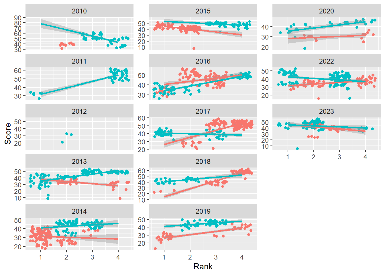
Allow both scales = free:
base_plot +
  facet_wrap(facets = vars(Year),
             ncol = 3,
             dir = "v",
             scales = "free"
             )
`geom_smooth()` using formula = 'y ~ x'Warning: Removed 110 rows containing non-finite values (`stat_smooth()`).Warning: Removed 110 rows containing missing values (`geom_point()`).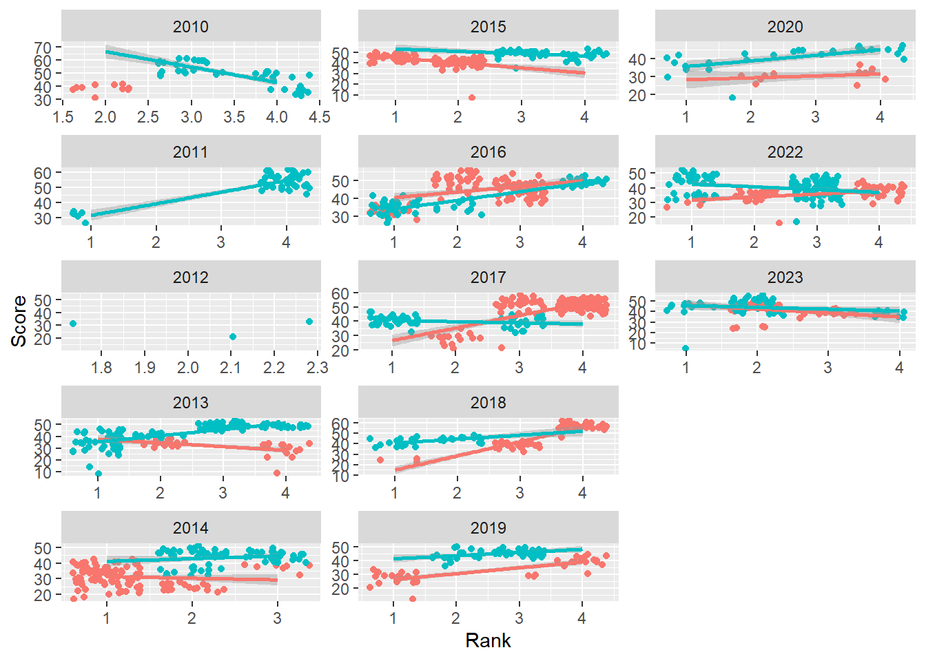
In this instance, comparing position of points is quite complicated. The view has to evaluate the axes, extract out the values, and then compare. Subtle patterns may be easier to see, however.
Ordering facets
The default ordering of facets is alphabetic/numeric. This may be fine when your facet variable is numeric but it may not be helpful when your facet variable is of character type. When your facet variable is not ordered as you wish, you can change the over by making your variable a factor() and specify the level order.
The default plot:
DATA |>
  ggplot(mapping = aes(x = Rank,
                       y = Score,
                       )) +
  geom_point(position = position_jitter()) +
  geom_smooth(mapping = aes(col = Team),
              method = "lm",
              fullrange = T
              ) +
  theme(legend.position = "none") +
  facet_wrap(facets = vars(Team))
`geom_smooth()` using formula = 'y ~ x'Warning: Removed 110 rows containing non-finite values (`stat_smooth()`).Warning: Removed 110 rows containing missing values (`geom_point()`).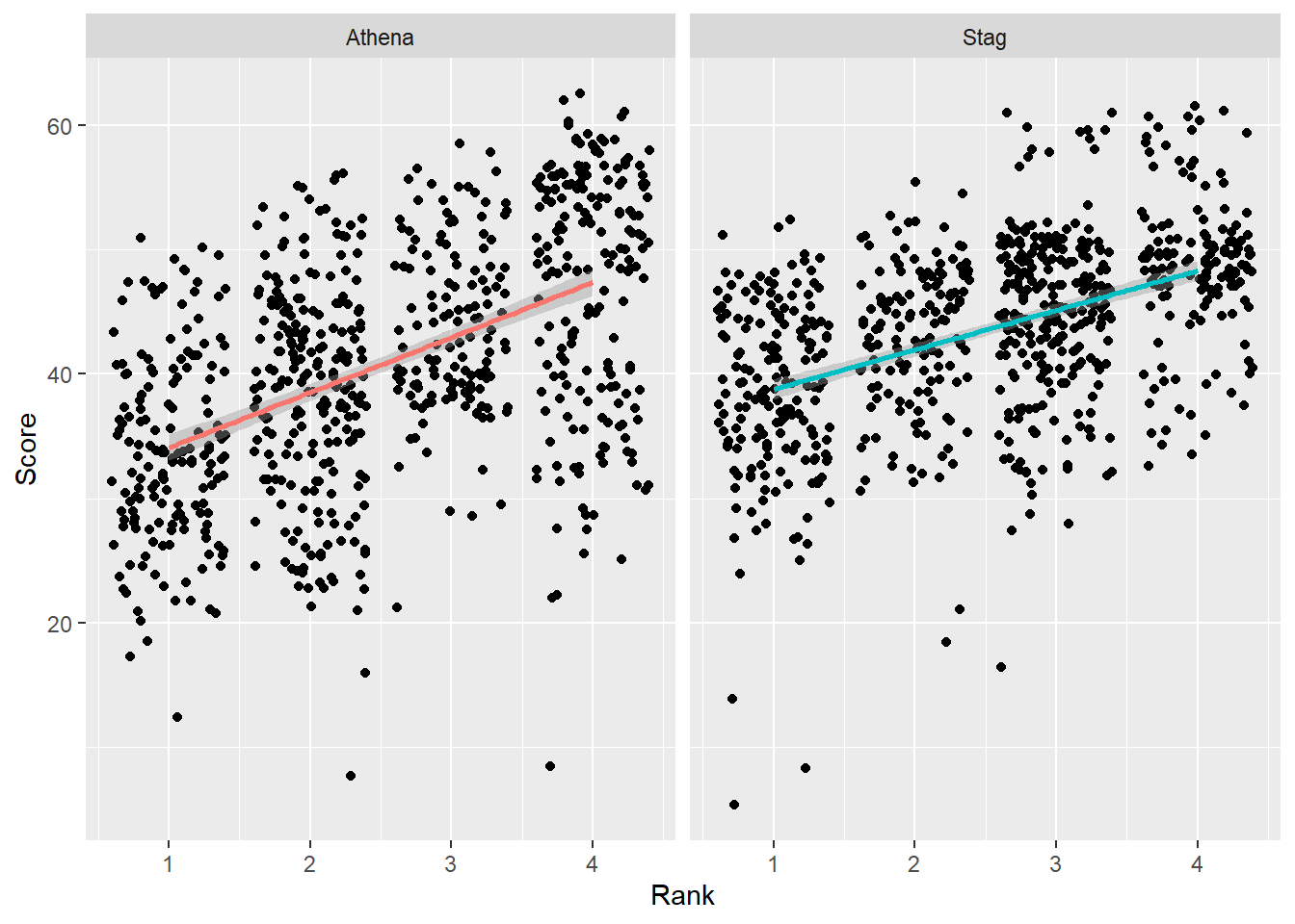
Change the order by ordering the factor()
DATA |>
  mutate(Team = factor(Team, levels = c("Stag", "Athena"))) |>     # factor and level order
  ggplot(mapping = aes(x = Rank,
                       y = Score,
                       )) +
  geom_point(position = position_jitter()) +
  geom_smooth(mapping = aes(col = Team),
              method = "lm",
              fullrange = T
              ) +
  theme(legend.position = "none") +
  facet_wrap(facets = vars(Team))
`geom_smooth()` using formula = 'y ~ x'Warning: Removed 110 rows containing non-finite values (`stat_smooth()`).Warning: Removed 110 rows containing missing values (`geom_point()`).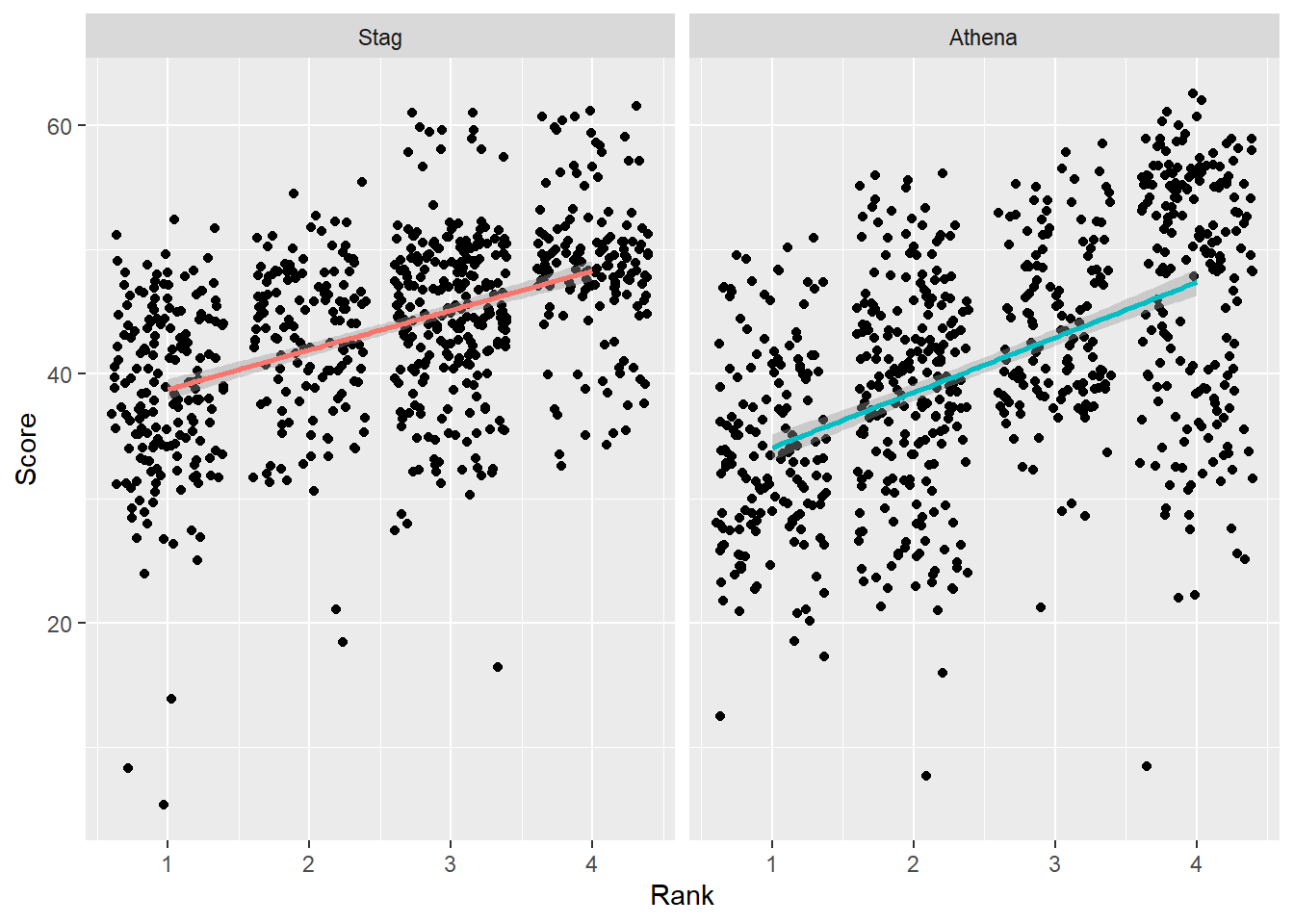
Change the order by ordering of the data using forcats::fct_reorder()
We can use forcats::fct_reorder() for reordering as we have done before for single plots. When the levels of a factor occur more than once, fct_reorder() applies a summary function, which by default is median() and the sorting order is from lowest to highest value. W
Order by the default behavior
We can add the arguments so they are visible.
DATA |>
  mutate(Team = forcats::fct_reorder(.f = Team,      # the factor to sort
                                     .x = Score,     # the variable to sort by
                                     .fun = median,  # the default function
                                     .desc = FALSE   # the default sorting behavior
                                     )
         ) |>
  ggplot(mapping = aes(x = Rank,
                       y = Score,
                       )) +
  geom_point(position = position_jitter()) +
  geom_smooth(mapping = aes(col = Team),
              method = "lm",
              fullrange = T
              ) +
  theme(legend.position = "none") +
  facet_wrap(facets = vars(Team))
`geom_smooth()` using formula = 'y ~ x'Warning: Removed 110 rows containing non-finite values (`stat_smooth()`).Warning: Removed 110 rows containing missing values (`geom_point()`).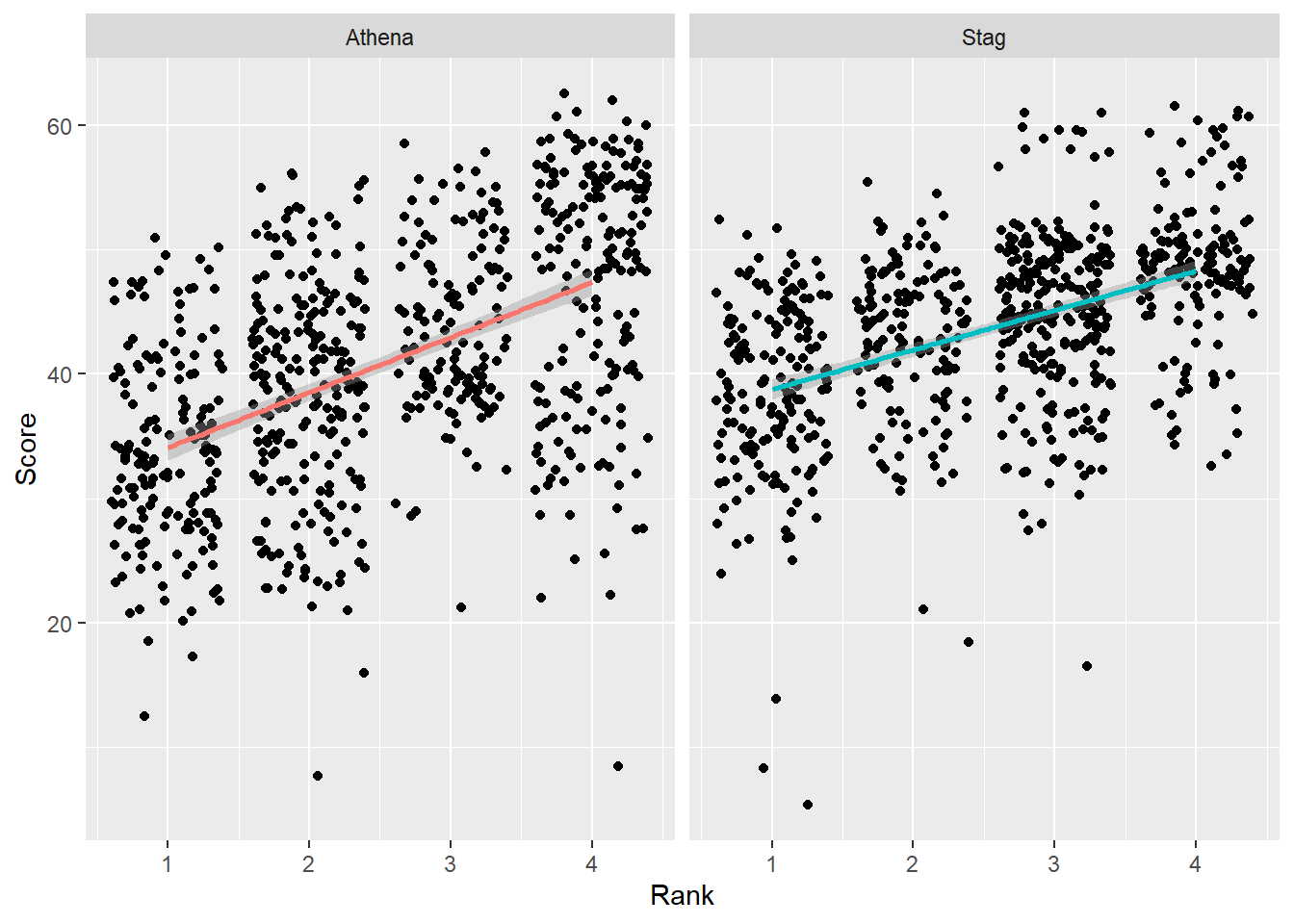
Order by the mean() and sort from highest to lowest
DATA |>
  mutate(Team = forcats::fct_reorder(.f = Team,      # the factor to sort
                                     .x = Score,     # the variable to sort by
                                     .fun = median,  # the default function
                                     .desc = FALSE   # the default sorting behavior
                                     )
         ) |>
  ggplot(mapping = aes(x = Rank,
                       y = Score,
                       )) +
  geom_point(position = position_jitter()) +
  geom_smooth(mapping = aes(col = Team),
              method = "lm",
              fullrange = T
              ) +
  theme(legend.position = "none") +
  facet_wrap(facets = vars(Team))
`geom_smooth()` using formula = 'y ~ x'Warning: Removed 110 rows containing non-finite values (`stat_smooth()`).Warning: Removed 110 rows containing missing values (`geom_point()`).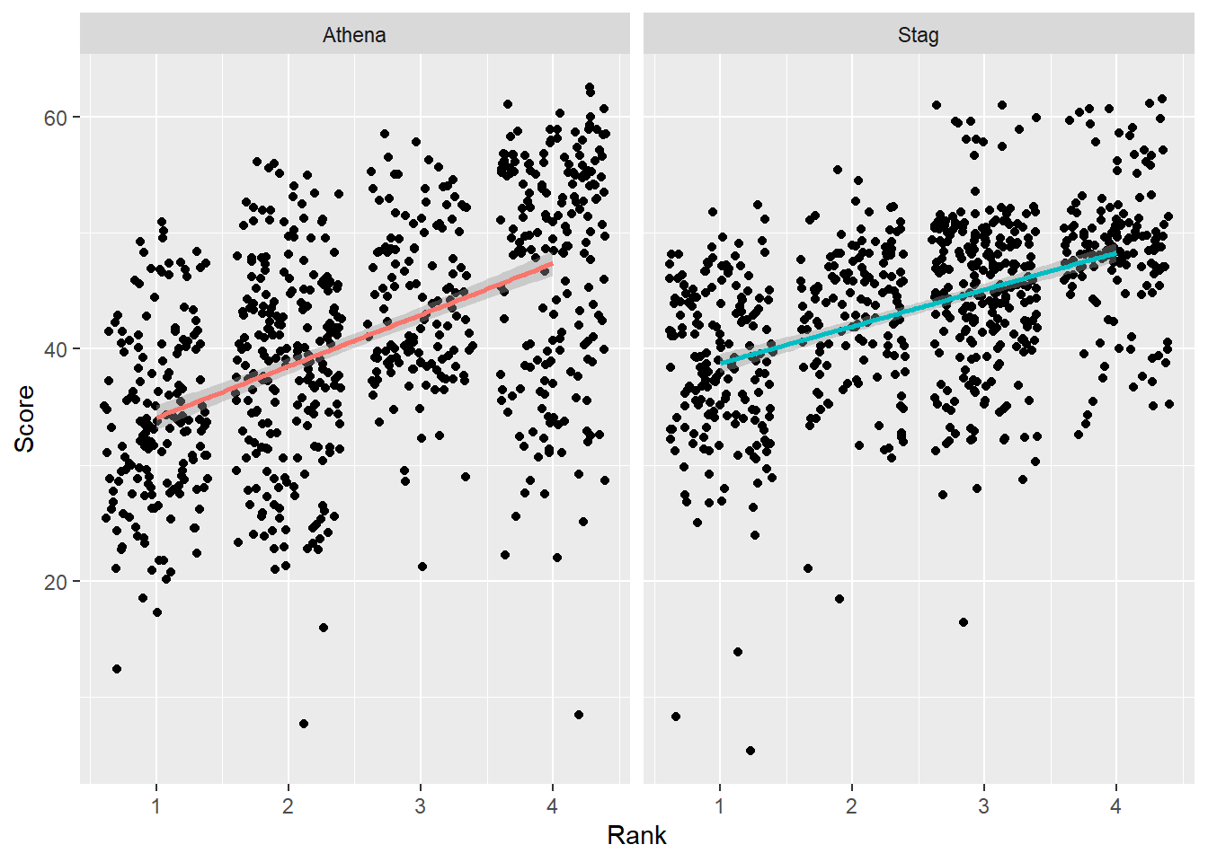
Order by a function
We can pass a function that determines the difference between the mean() and the median(). If we can about the difference being positive or negative, the order of these computations will matter. If we want to order based on the size of the difference between the two metrics, we can take the absolute value of the difference using abs().
abs(med(x) - mean(x)): a difference between median and meanmean(x, trim = 0.1): the mean that is based on trimming the outlying 10%max(x) - min(x)): the range
DATA |>
  mutate(Team = forcats::fct_reorder(.f = Team,      # the factor to sort
                                     .x = Score,     # the variable to sort by
                                     .fun = function(x) { abs(median(x) - mean(x)) },  # a custom function for the range
                                     .desc = T       # from largest value to the smallest
                                     )
         ) |>
  ggplot(mapping = aes(x = Rank,
                       y = Score,
                       )) +
  geom_point(position = position_jitter()) +
  geom_smooth(mapping = aes(col = Team),
              method = "lm",
              fullrange = T
              ) +
  theme(legend.position = "none") +
  facet_wrap(facets = vars(Team)) +
  labs(title = "")
`geom_smooth()` using formula = 'y ~ x'Warning: Removed 110 rows containing non-finite values (`stat_smooth()`).Warning: Removed 110 rows containing missing values (`geom_point()`).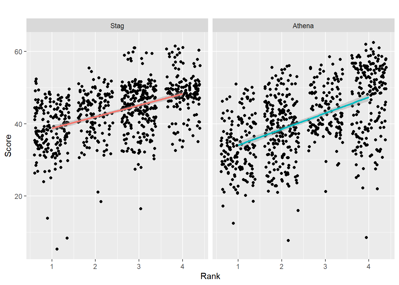
Importantly, the ordering of the panels in the facet plot always communicates information that is not visible or easily extracted from the visualization. By default, this ordering is by character or number. The facet with the largest mean may appear in facet position 1 or 12 (think random) but your goal may not be to communicate that difference across facets. A systematic ordering of the panels, however, using fct_reorder() represents a decision (whether conscious or not) to order the panels based on some method other than the default alphabetical or numeric order. This consequence is because both fct_reorder() and fct_reorder2() apply a function by with to order the data based on some variable and they then apply a sorting method based on that function. When you consciously apply fct_reorder(), you are doing so for a specific reason. Thus, you would want to communicate that information either in the plot title, subtitle, caption, or in a written report. Keep in mind that the ordering of panels reflects data compared across panels in the data visualization.
Repositioning the label strip
By default, the facet label will be on the top of the plot because strip.position = "top" but you can set to "top", "bottom", "left", or "right".
Let’s set strip.position = "left":
DATA |>
  mutate(Team = factor(Team, levels = c("Stag", "Athena"))) |>     # factor and level order
  ggplot(mapping = aes(x = Rank,
                       y = Score,
                       )) +
  geom_point(position = position_jitter()) +
  geom_smooth(mapping = aes(col = Team),
              method = "lm",
              fullrange = T
              ) +
  theme(legend.position = "none") +
  facet_wrap(facets = vars(Team),
             strip.position = "left"
             )
`geom_smooth()` using formula = 'y ~ x'Warning: Removed 110 rows containing non-finite values (`stat_smooth()`).Warning: Removed 110 rows containing missing values (`geom_point()`).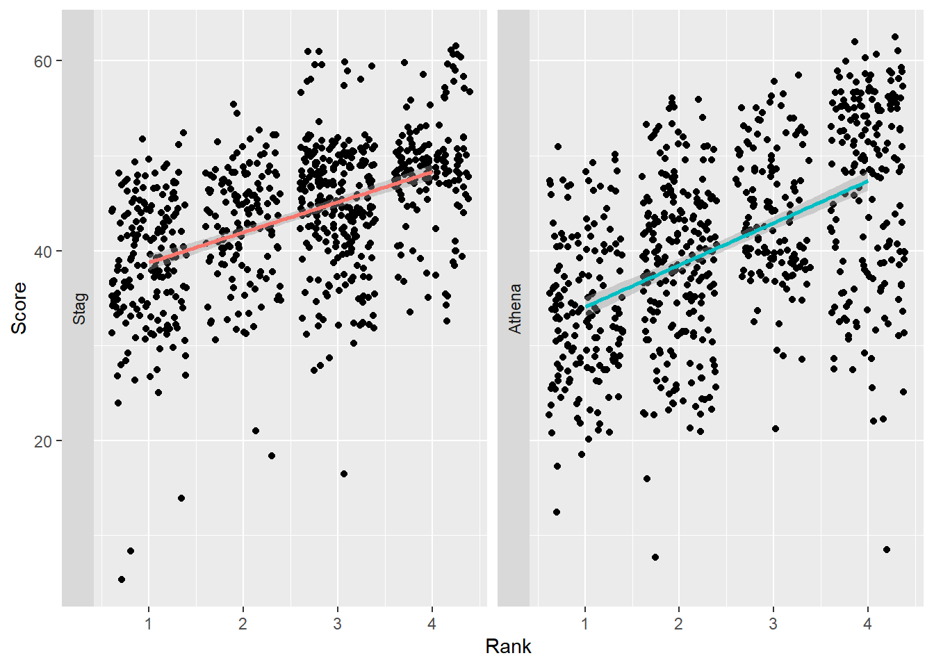
Let’s set strip.position = "bottom":
Although this repositioning is handled by theme(), theme(strip.placement = "outside")
DATA |>
  mutate(Team = factor(Team, levels = c("Stag", "Athena"))) |>     # factor and level order
  ggplot(mapping = aes(x = Rank,
                       y = Score,
                       )) +
  geom_point(position = position_jitter()) +
  geom_smooth(mapping = aes(col = Team),
              method = "lm",
              fullrange = T
              ) +
  theme(legend.position = "none") +
  facet_wrap(facets = vars(Team),
             strip.position = "bottom"
             )
`geom_smooth()` using formula = 'y ~ x'Warning: Removed 110 rows containing non-finite values (`stat_smooth()`).Warning: Removed 110 rows containing missing values (`geom_point()`).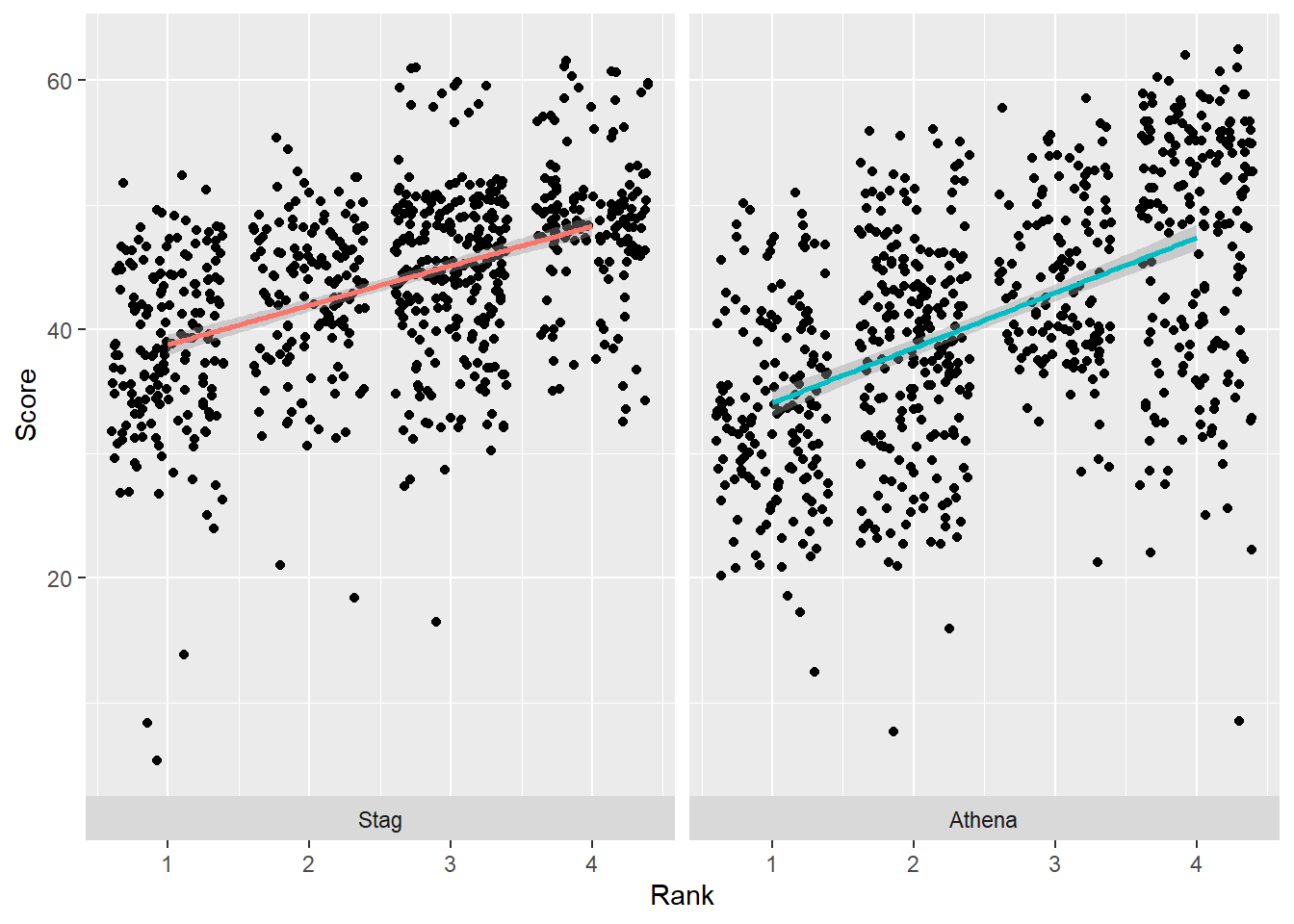
Faceting bars
Bar plots are faceted in the same manner as for points. The comparisons are just different, for example, with the height of bars.
DATA |>
  mutate(Team = factor(Team, levels = c("Stag", "Athena"))) |>     # factor and level order
  group_by(Team, Rank) |>
  summarize(Mean_Score = mean(Score, na.rm = T)) |>
  ungroup() |>
  filter(!is.na(Rank)) |>
  ggplot(mapping = aes(x = Rank,
                       y = Mean_Score,
                       fill = Team
                       )) +
  geom_col()
`summarise()` has grouped output by 'Team'. You can override using the
`.groups` argument.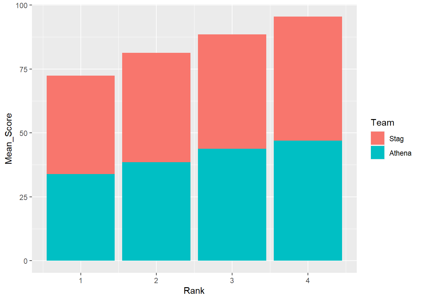
Remember, by default geom_col() will stack bars.
DATA |>
  mutate(Team = factor(Team, levels = c("Stag", "Athena"))) |>     # factor and level order
  group_by(Team, Rank) |>
  summarize(Mean_Score = mean(Score, na.rm = T)) |>
  ungroup() |>
  filter(!is.na(Rank)) |>
  ggplot(mapping = aes(x = Rank,
                       y = Mean_Score,
                       fill = Team
                       )) +
  geom_col() +
  facet_wrap(facet = vars(Team))
`summarise()` has grouped output by 'Team'. You can override using the
`.groups` argument.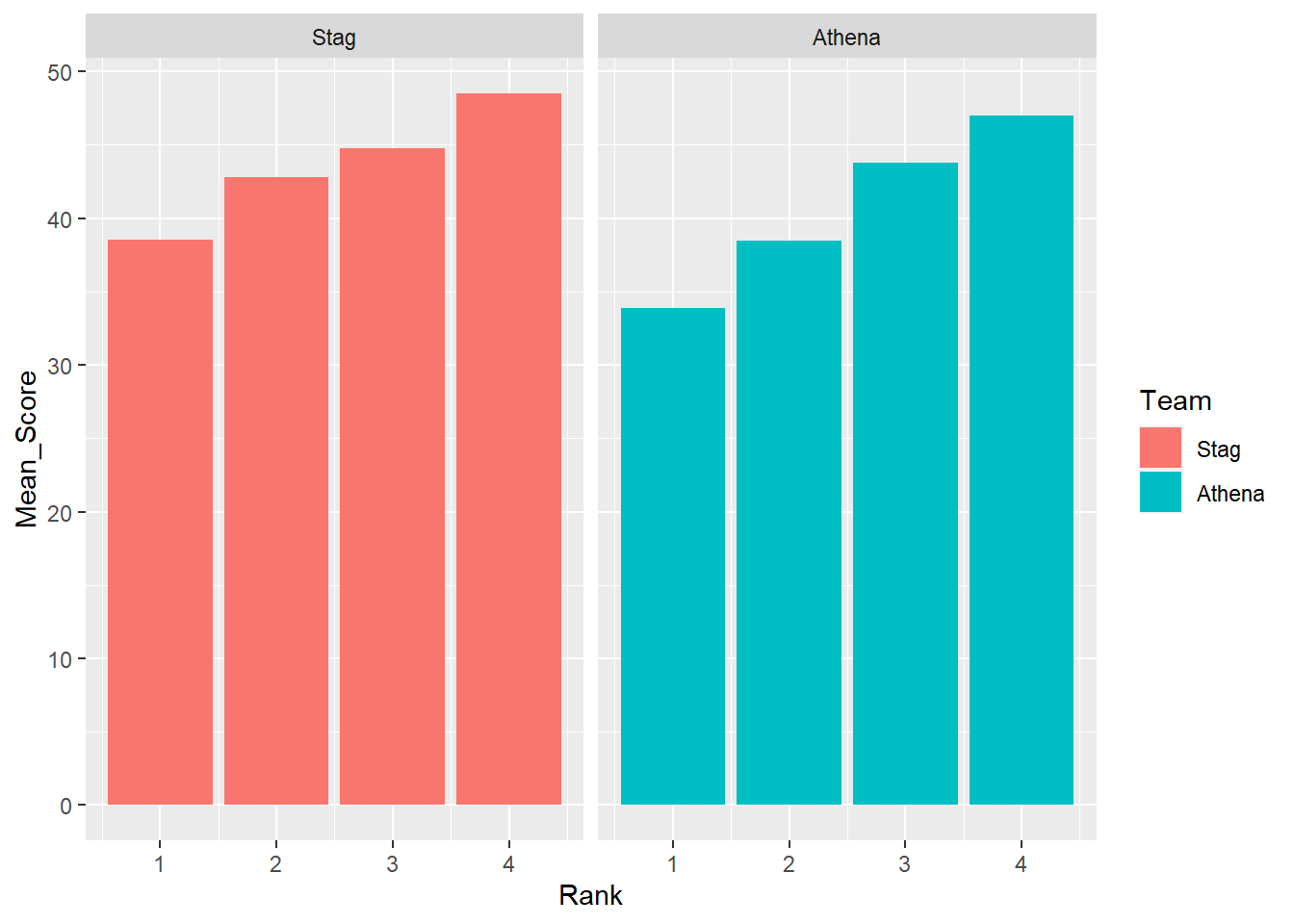
To remove any associate color that could be distracting, remove the aesthetic.
DATA |>
  mutate(Team = factor(Team, levels = c("Stag", "Athena"))) |>     # factor and level order
  group_by(Team, Rank) |>
  summarize(Mean_Score = mean(Score, na.rm = T)) |>
  ungroup() |>
  filter(!is.na(Rank)) |>
  ggplot(mapping = aes(x = Rank,
                       y = Mean_Score
                       )) +
  geom_col() +
  facet_wrap(facet = vars(Team))
`summarise()` has grouped output by 'Team'. You can override using the
`.groups` argument.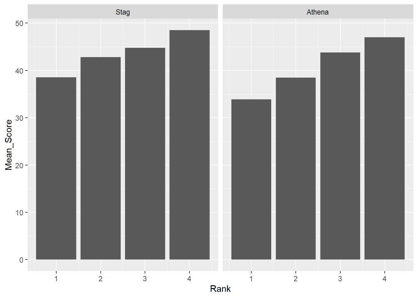
Or to facilitate comparisons across Rank, map that variable to fill.
DATA |>
  mutate(Team = factor(Team, levels = c("Stag", "Athena"))) |>     # factor and level order
  group_by(Team, Rank) |>
  summarize(Mean_Score = mean(Score, na.rm = T)) |>
  ungroup() |>
  filter(!is.na(Rank)) |>
  ggplot(mapping = aes(x = Rank,
                       y = Mean_Score,
                       fill = factor(Rank)
                       )) +
  geom_col() +
  facet_wrap(facet = vars(Team))
`summarise()` has grouped output by 'Team'. You can override using the
`.groups` argument.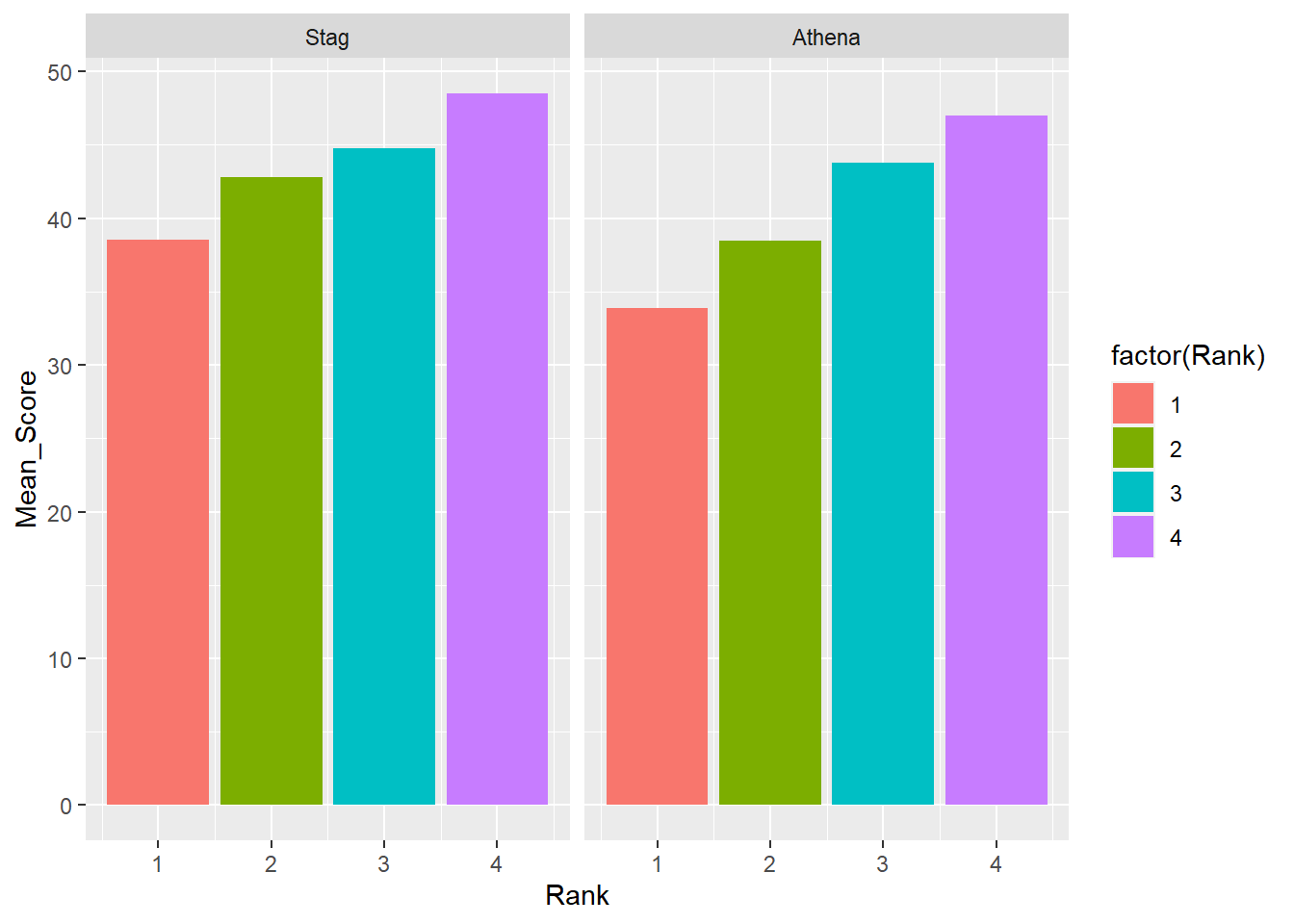
Arrangement matters. Comparing bars across rows is more demanding cognitively.
DATA |>
  mutate(Team = factor(Team, levels = c("Stag", "Athena"))) |>     # factor and level order
  group_by(Team, Rank) |>
  summarize(Mean_Score = mean(Score, na.rm = T)) |>
  ungroup() |>
  filter(!is.na(Rank)) |>
  ggplot(mapping = aes(x = Rank,
                       y = Mean_Score,
                       fill = factor(Rank)
                       )) +
  geom_col() +
  facet_wrap(facet = vars(Team), ncol = 1)
`summarise()` has grouped output by 'Team'. You can override using the
`.groups` argument.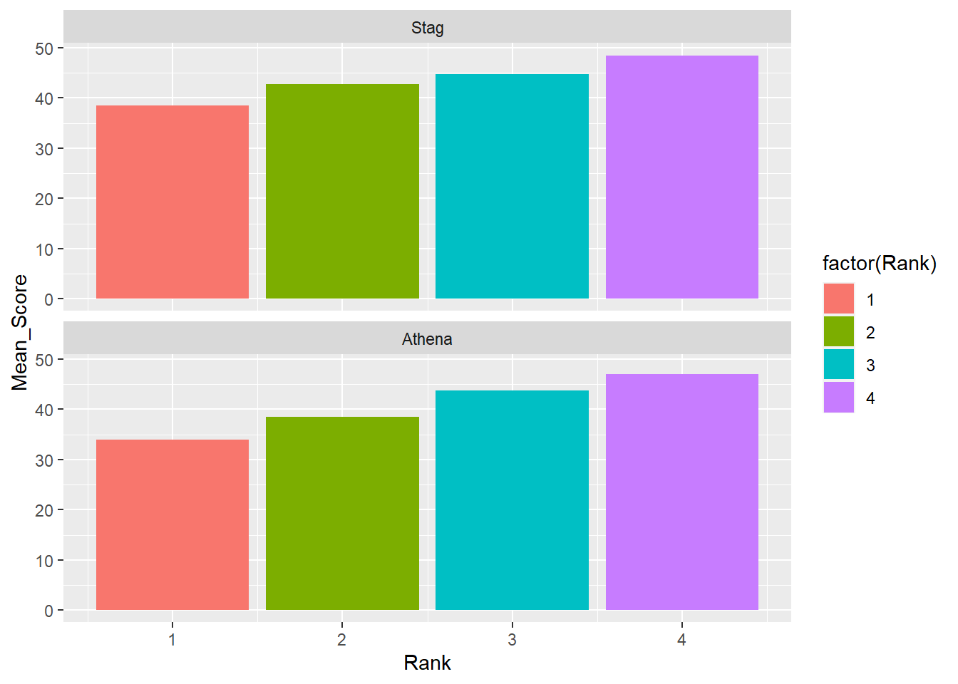
Facet Grid
Some of the same goals can be completed using facet_grid(). For this function, you will facet by specifying the rows and the cols for the grid.
facet_grid(rows = vars())
DATA |>
  mutate(Team = factor(Team, levels = c("Stag", "Athena"))) |>     # factor and level order
  group_by(Team, Rank) |>
  summarize(Mean_Score = mean(Score, na.rm = T)) |>
  ungroup() |>
  filter(!is.na(Rank)) |>
  ggplot(mapping = aes(x = Rank,
                       y = Mean_Score,
                       fill = factor(Rank)
                       )) +
  geom_col() +
  facet_grid(rows = vars(Team))
`summarise()` has grouped output by 'Team'. You can override using the
`.groups` argument.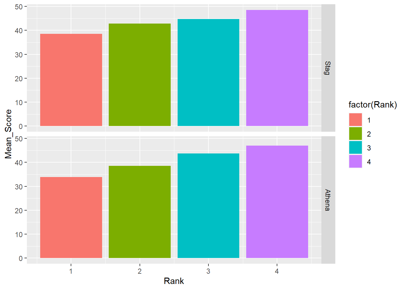
Be careful what you facet as you might create something you don’t intend.
DATA |>
  mutate(Team = factor(Team, levels = c("Stag", "Athena"))) |>     # factor and level order
  group_by(Team, Rank) |>
  summarize(Mean_Score = mean(Score, na.rm = T)) |>
  ungroup() |>
  filter(!is.na(Rank)) |>
  ggplot(mapping = aes(x = Rank,
                       y = Mean_Score,
                       fill = factor(Rank)
                       )) +
  geom_col() +
  facet_grid(rows = vars(Rank))
`summarise()` has grouped output by 'Team'. You can override using the
`.groups` argument.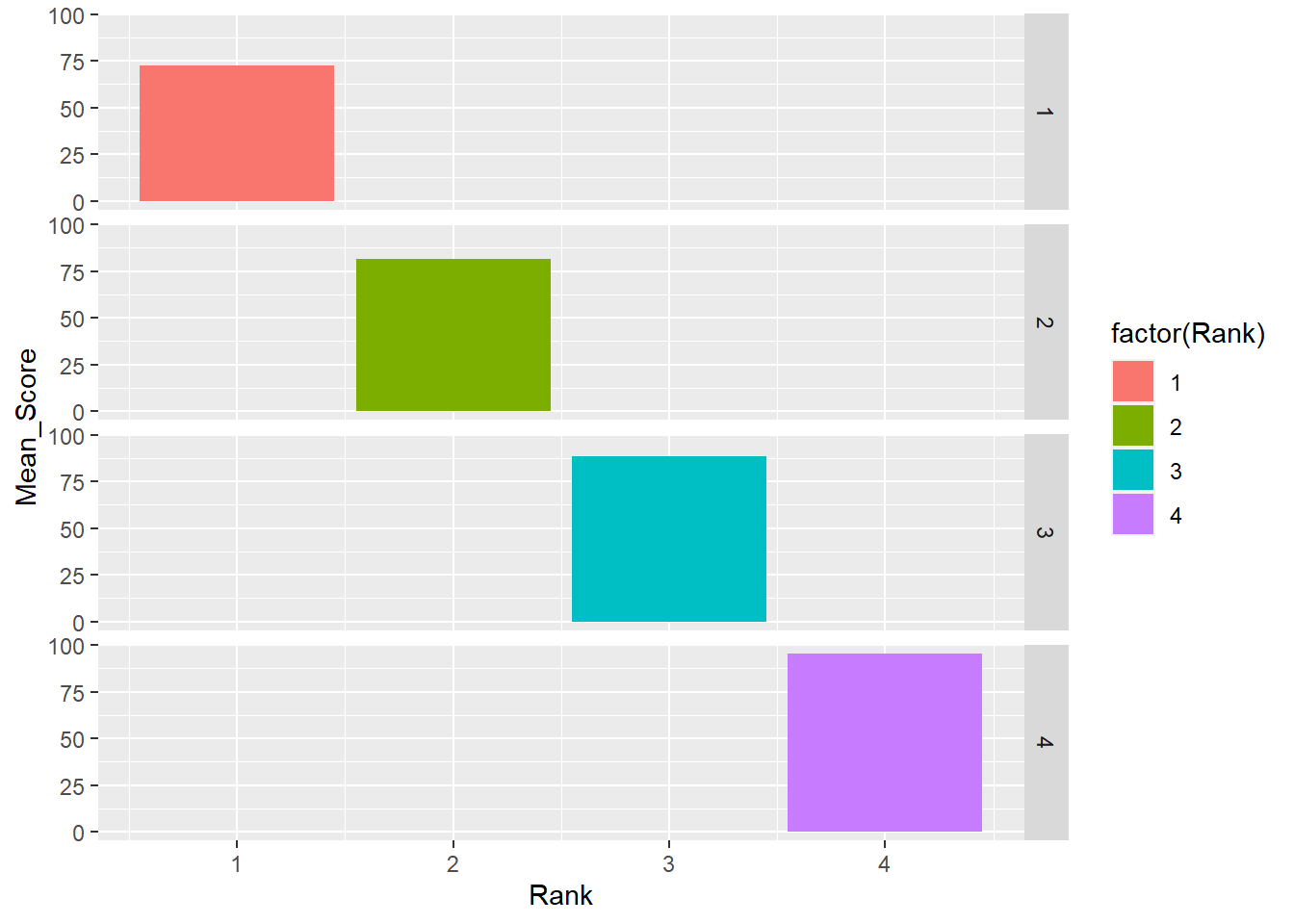
facet_grid(cols = vars())
DATA |>
  mutate(Team = factor(Team, levels = c("Stag", "Athena"))) |>     # factor and level order
  group_by(Team, Rank) |>
  summarize(Mean_Score = mean(Score, na.rm = T)) |>
  ungroup() |>
  filter(!is.na(Rank)) |>
  ggplot(mapping = aes(x = Rank,
                       y = Mean_Score,
                       fill = factor(Rank)
                       )) +
  geom_col() +
  facet_grid(cols = vars(Team))
`summarise()` has grouped output by 'Team'. You can override using the
`.groups` argument.
Rows and columns facet_grid(cols = vars())
If your variables allow, you can combine the two.
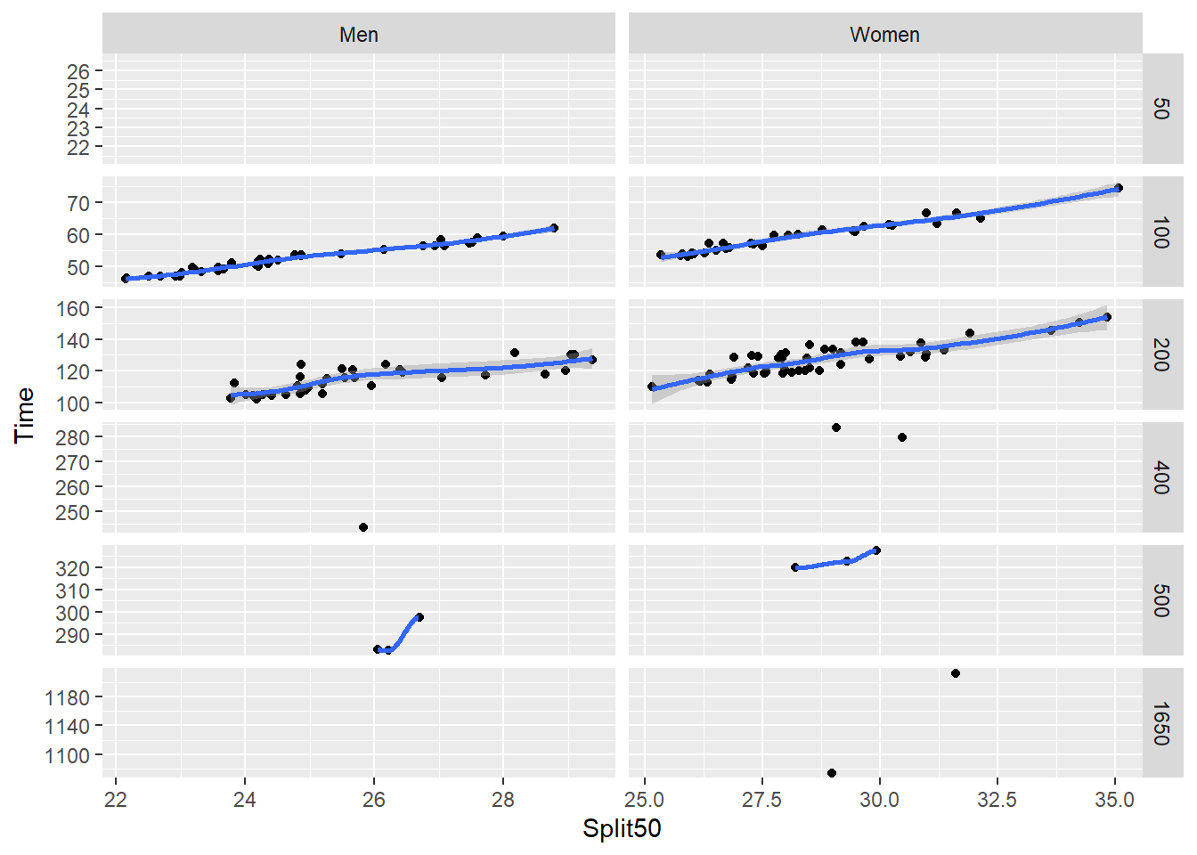
SWIM <- readr::read_csv("https://github.com/slicesofdata/dataviz23/raw/main/data/swim/cleaned-2023-CMS-Invite.csv", show_col_types = F)

SWIM |>
  filter(Distance > 50 & Distance < 500) |>
  ggplot(mapping = aes(x = Split50,
                       y = Time
                       )) +
  geom_point(position = position_jitter()) +
  geom_smooth() +
  facet_grid(rows = vars(Event),
             cols = vars(Distance)
             )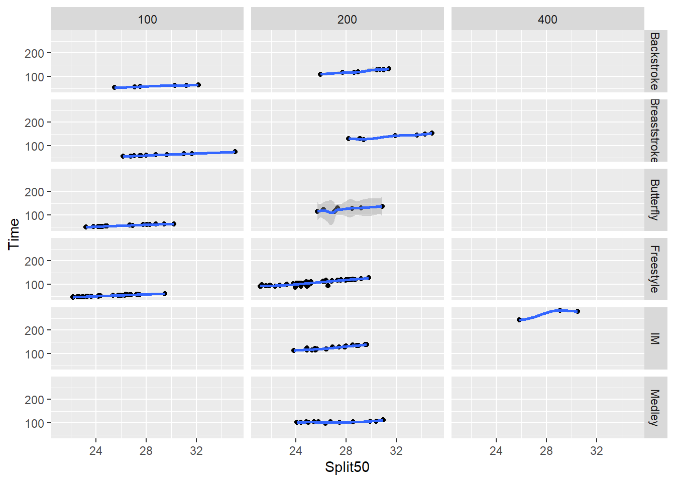
Or by a character vector variable.
SWIM |>
  filter(Team != "Mixed") |>
  filter(Team != "Freestyle") |>
  ggplot(mapping = aes(x = Split50,
                       y = Time
                       )) +
  geom_point(position = position_jitter()) +
  geom_smooth() +
  facet_grid(rows = vars(Distance),
             cols = vars(Team)
             )
Clearly, we need to clean up the axes for this plot. You can allow scales to vary as was done using facet_wrap() or you can adjust the scales.
SWIM |>
  filter(Team != "Mixed") |>
  filter(Team != "Freestyle") |>
  ggplot(mapping = aes(x = Split50,
                       y = Time
                       )) +
  geom_point(position = position_jitter()) +
  geom_smooth() +
  facet_grid(rows = vars(Distance),
             cols = vars(Team),
             scales = "free"
             )
Session Info
R version 4.3.1 (2023-06-16 ucrt)
Platform: x86_64-w64-mingw32/x64 (64-bit)
Running under: Windows 11 x64 (build 22621)

Matrix products: default


locale:
[1] LC_COLLATE=English_United States.utf8
[2] LC_CTYPE=English_United States.utf8
[3] LC_MONETARY=English_United States.utf8
[4] LC_NUMERIC=C
[5] LC_TIME=English_United States.utf8

time zone: America/Los_Angeles
tzcode source: internal

attached base packages:
[1] stats     graphics  grDevices utils     datasets  methods   base

other attached packages:
[1] forcats_1.0.0  ggplot2_3.4.3  magrittr_2.0.3 dplyr_1.1.2

loaded via a namespace (and not attached):
 [1] bit_4.0.5         Matrix_1.6-1      gtable_0.3.4      jsonlite_1.8.7
 [5] crayon_1.5.2      compiler_4.3.1    tidyselect_1.2.0  parallel_4.3.1
 [9] splines_4.3.1     scales_1.2.1      yaml_2.3.7        fastmap_1.1.1
[13] lattice_0.21-8    here_1.0.1        readr_2.1.4       R6_2.5.1
[17] labeling_0.4.2    generics_0.1.3    curl_5.0.2        knitr_1.43
[21] htmlwidgets_1.6.2 tibble_3.2.1      munsell_0.5.0     rprojroot_2.0.3
[25] tzdb_0.4.0        pillar_1.9.0      rlang_1.1.1       utf8_1.2.3
[29] xfun_0.40         bit64_4.0.5       cli_3.6.1         withr_2.5.0
[33] mgcv_1.8-42       digest_0.6.33     grid_4.3.1        vroom_1.6.3
[37] rstudioapi_0.15.0 hms_1.1.3         lifecycle_1.0.3   nlme_3.1-162
[41] vctrs_0.6.3       evaluate_0.21     glue_1.6.2        farver_2.1.1
[45] fansi_1.0.4       colorspace_2.1-0  rmarkdown_2.24    tools_4.3.1
[49] pkgconfig_2.0.3   htmltools_0.5.6