R.utils::sourceDirectory(here::here("src", "functions"))Attentional control
This page is a work in progress and may contain areas that need more detail or that required syntactical, grammatical, and typographical changes. If you find some part requiring some editing, please let me know so I can fix it for you.
Overview
When creating data visualizations, your data should be communicated in a way that does not require your audience to think too much about the main points. This does not mean that viewers should not engage in deep and thoughtful interpretation of the data and look for patterns that are not perfectly clear. The visualization should be designed to communicate a particular goal, however, which is essential to the creation process. On some occasions, you may want to focus attention to particular plot elements. We have done this before by changing colors, shapes, size, and other decorative properties of visualizations. We have also narrowed the space by creating visualizations for a specific subset of the data (e.g., team, event, etc.) and we have guided attention by creating small multiples of a particular plot. Panel or facet plots present the same data that is presented in a plot for which an aesthetic is mapped to variables (creating a legend) but panel plots isolate the subgroups by creating separate plots. We have seen advantages and disadvantages of this approach. There are always trade offs if only one plot type is used.
For this module, the goal is to further explore ways for you to control the attention of your audience. You may need to highlight some relevant or interesting aspect of the data that may be overlooked. You may also need to guide attention to a subset of data or a plot region so that your audience has no ambiguity about where to look and how to inspect. Controlling attention in these ways will of course have associated trade offs. You should evaluate the trade offs and ask yourself whether directing attention to a plot region or to a subset of data achieves your intended goal. If doing so may complicate plot interpretation or confuse user, then consider other ways. If you want to facilitate your audience making comparisons between the data or region of interest and other data or regions, then directing their attention may be preferred to creating multiple visualizations as comparisons can be compromised when make across space, pages, and time.
To Do
Readings
External Functions
Provided:
view_html(): for viewing data frames in html format, from /src/functions/view_html.R
Libraries
- {dplyr} 1.1.4: for selecting, filtering, and mutating
- {ggplot2} 3.5.1: for plotting
- {ggrepel} 0.9.5: for repelling labels from points and lines
- {geomtextpath} 0.1.4: for annotation of curved paths (also straight)
- {gghighlight} 0.4.1: for highlighting lines and points
- {ggtext} 0.1.2: for text on plots; markdown elements (viz, element_markdown)
Loading Libraries
library(dplyr)
library(magrittr)
Attaching package: 'magrittr'The following object is masked from 'package:purrr':
set_namesThe following object is masked from 'package:tidyr':
extractlibrary(ggplot2)
library(ggrepel)
library(geomtextpath)
library(gghighlight)
library(ggtext)view_html(DATA_summary)Sizing up plot elements
The font size of plot elements can be increased to make them more easy to process. You can do this by adjusting text elements within theme().
Increase the size of axis labels
For each axis.text.<axis>, you can adjust the element_text().
axis.text.x = element_text(size = 12)axis.text.y = element_text(size = 12)
(base_plot <- DATA |>
  filter(Year == 2019) |>
  ggplot(mapping = aes(x = Rank,
                       y = Score,
                       col = Team
                       )
         ) +
  geom_point(size = 2.2,
             alpha = .8,
             position = position_jitter(height = 0, seed = 167)
             ) +
  ylim(0, 60) +
  theme(axis.text.x = element_text(size = 12),  # x-axis size
        axis.text.y = element_text(size = 12)   # y-axis size
        )
)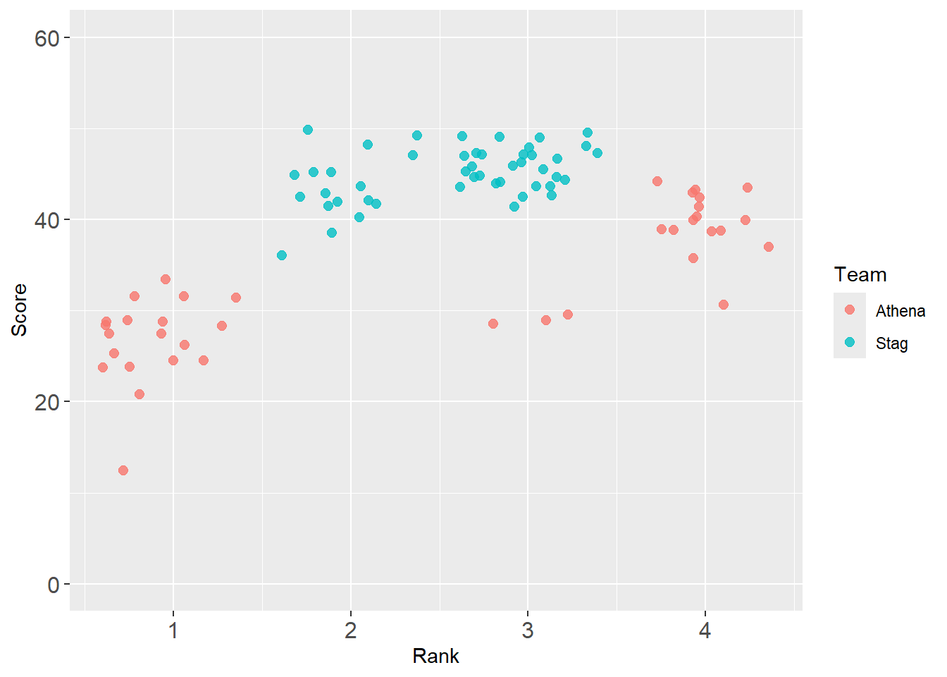
Notice that this adjustment does not increase the legend text size too. This is a different element.
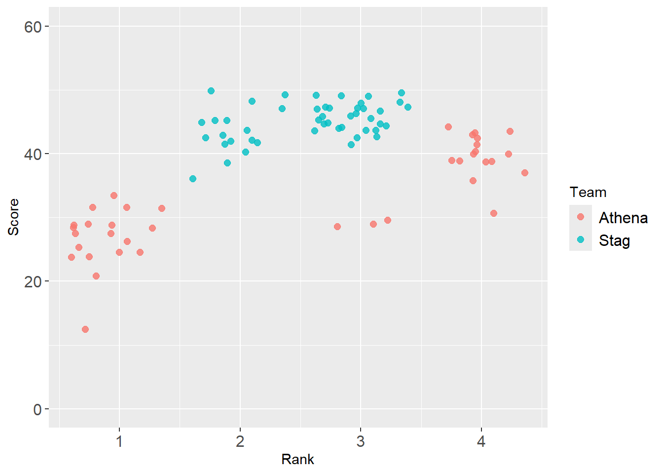
Increase the size of the legend labels
legend.text = element_text(size = 12)
base_plot +
  theme(axis.text.x = element_text(size = 12),  # x-axis size
        axis.text.y = element_text(size = 12),  # y-axis size
        legend.text = element_text(size = 12)   # legend text size
) 
Increase the size of the legend ‘shapes’
We have already addressed how to make legend shape elements larger too. This adjustment is in the guides() and requires overriding aesthetics. We need to add a guides() layer. Importantly, you need to be careful to specify the aesthetic mapped, in this case col. If you mapped a variable to a discrete color, then you will need to change the size of the col aesthetics. If you mapped a variable to a shape, and you want to increase the size of the shapes, then you will need to change the size of the shape aesthetics.
guides(<aesthetic mapped> = guide_legend(override.aes = list(size = 3)))
In this example, col was mapped and the goal is to change the size of the color ‘shape’ so the solution is:
guides(col = guide_legend(override.aes = list(size = 3)))
There is no shape mapping, so changing the size of the shape will not work:
guides(shape = guide_legend(override.aes = list(size = 3)))
base_plot +
  theme(axis.text.x = element_text(size = 12),  # x-axis size
        axis.text.y = element_text(size = 12),  # y-axis size
        legend.text = element_text(size = 12)   # legend text size
        ) +
  guides(col = guide_legend(override.aes = list(size = 3)))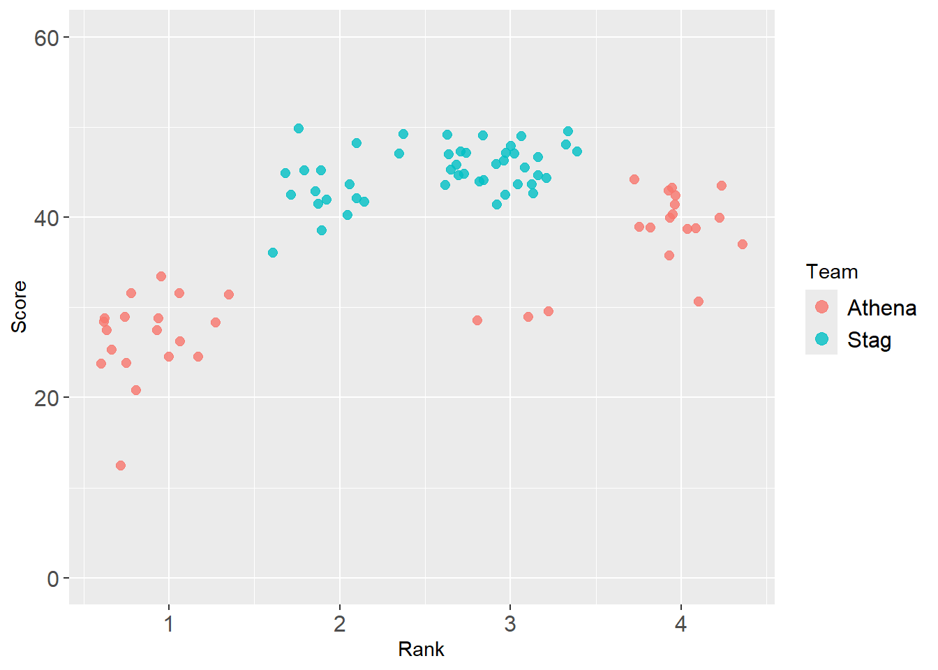
Passing objects for adjustments
Of course, the points on the plot are small too, so you would want to adjust them if necessary. We can use some objects to make the process easier. If you want to apply the same approach to many or all plots you create, you might just prefer to create a custom theme().
point_size <- 3
font_size  <- 11

base_plot +
  theme(
        # the axis text in general
        axis.text = element_text(size = font_size),     # both and ticks
        # or specifically
        #axis.text.x = element_text(size = font_size),  # x-axis size
        #axis.text.y = element_text(size = font_size),  # y-axis size

        # the title label
        axis.title = element_text(size = font_size + 3),  # bump it up relatively

        # the legend text
        legend.title = element_text(size = font_size + 1),  # legend title, bump up if desired
        legend.text = element_text(size = font_size)    # legend text size
        ) +
  guides(col = guide_legend(override.aes = list(size = point_size)))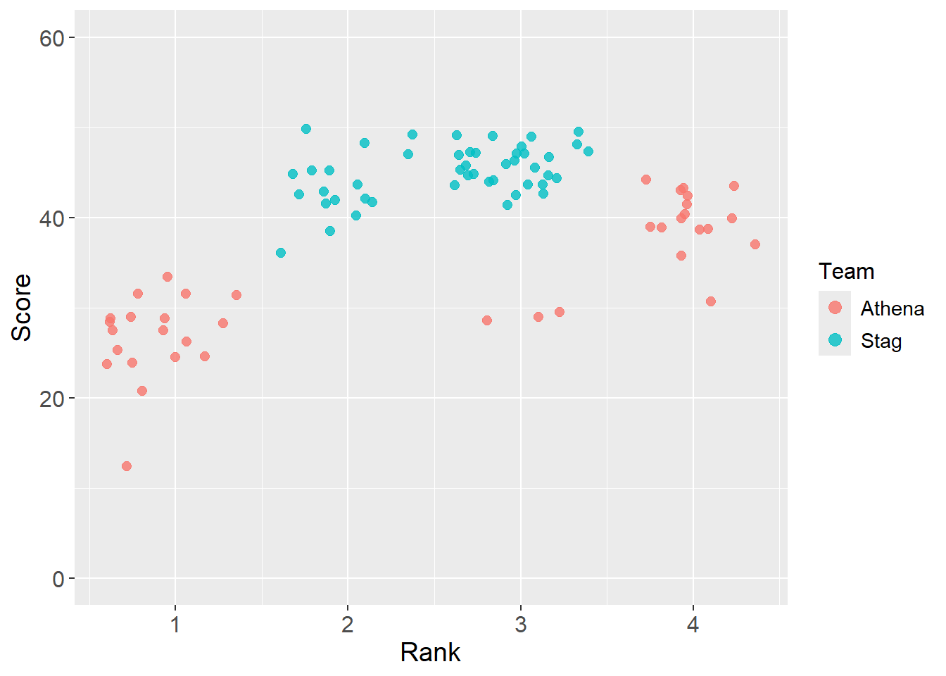
Identifying points of interest
Adding reference points
Let’s say you want to highlight a data point or location of interest. We can do so by specifying the point or region.
There are a few ways to address this. You can use stat_summary() to draw attention to a place on the plot, the mean of the variable mapped to y.
base_plot +
  stat_summary(
    fun = "mean",        # the summary function
    geom = "point",      # the geom
    #shape = 23,         # the geom_point shape if you wish to change it
    size = 3,            # the color
    #fill = "grey",      # fill color if your point has fill
    col = "grey20",        # the color
    alpha = .8
    )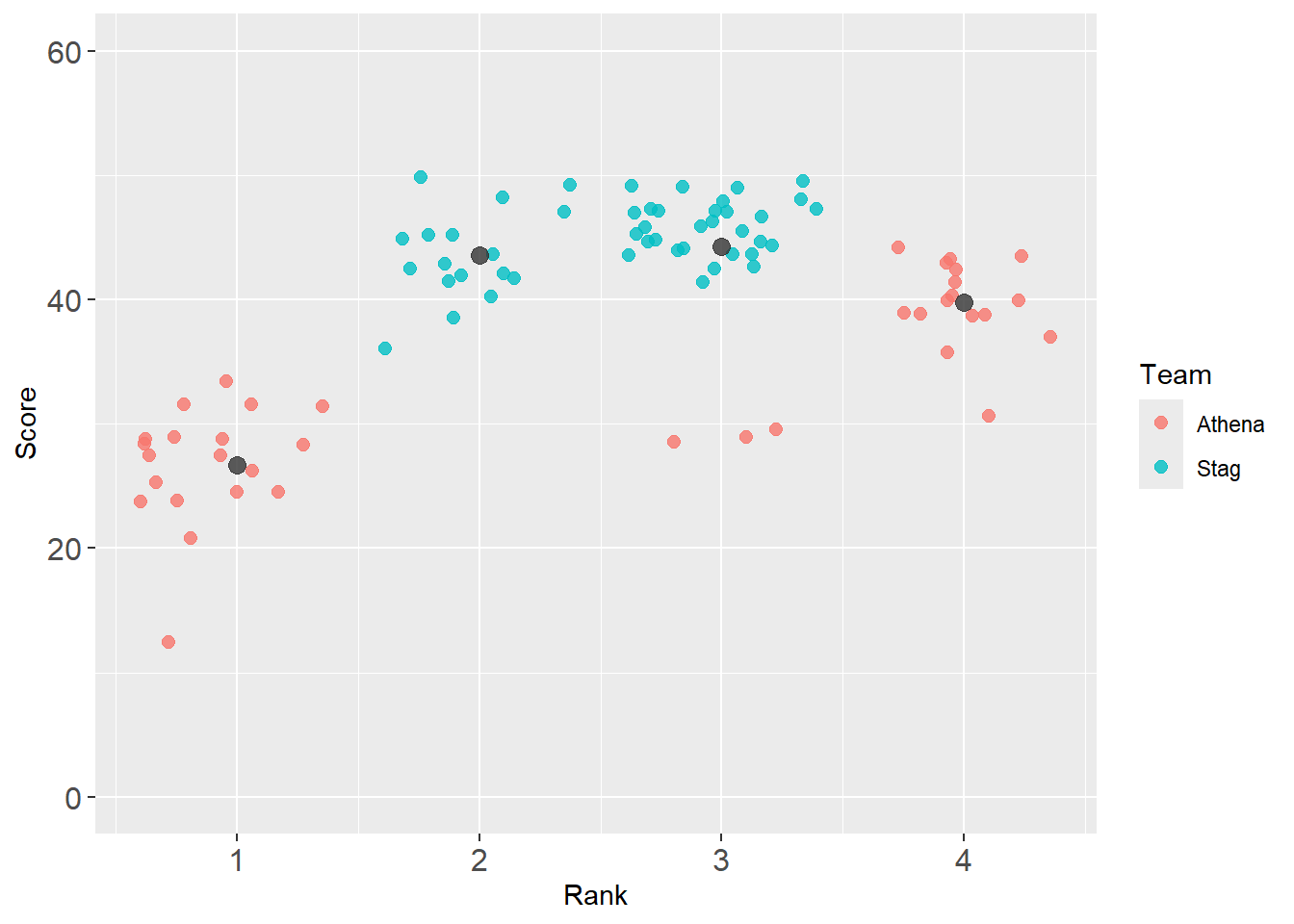
Whereas stat_summary() applies the function to the groups, you may wish to highlight a single point. When this is the case, you will use different data than what you pass to the ggplot() object.
The best athlete.
( best_2019 <- DATA |> filter(Year == 2019) |> slice_max(Score) )# A tibble: 1 × 7
Athlete Rank Score Meet Date Team Year
<chr> <dbl> <dbl> <chr> <chr> <chr> <dbl>
1 Sill, Michael 2 49.8 SCIAC Track & Field Conference Ch… Apr … Stag 2019When only x or y matters, you can specify that single point.
( mean_y_2019 <- DATA |> filter(Year == 2019) |> pull(Score) |> mean() )[1] 39.37329When x and y matter, you may wish to specify that point.
( mean_xy_2019 <- DATA |>
  filter(Year == 2019) |>
  summarize(Rank = mean(Rank, na.rm = T),
            Score = mean(Score, na.rm = T)
  )
)
# A tibble: 1 × 2
Rank Score
<dbl> <dbl>
1 2.54 39.4( team_mean_xy_2019 <- DATA |>
filter(Year == 2019) |>
group_by(Team) |>
summarize(Rank = mean(Rank, na.rm = T),
Score = mean(Score, na.rm = T)
)
) # A tibble: 2 × 3
Team Rank Score
<chr> <dbl> <dbl>
1 Athena 2.42 32.4
2 Stag 2.64 45.0Adding reference line
Let’s plot a horizontal line using geom_hline() to direct attention for reference or comparison.
base_plot +
  geom_hline(yintercept = mean_y_2019)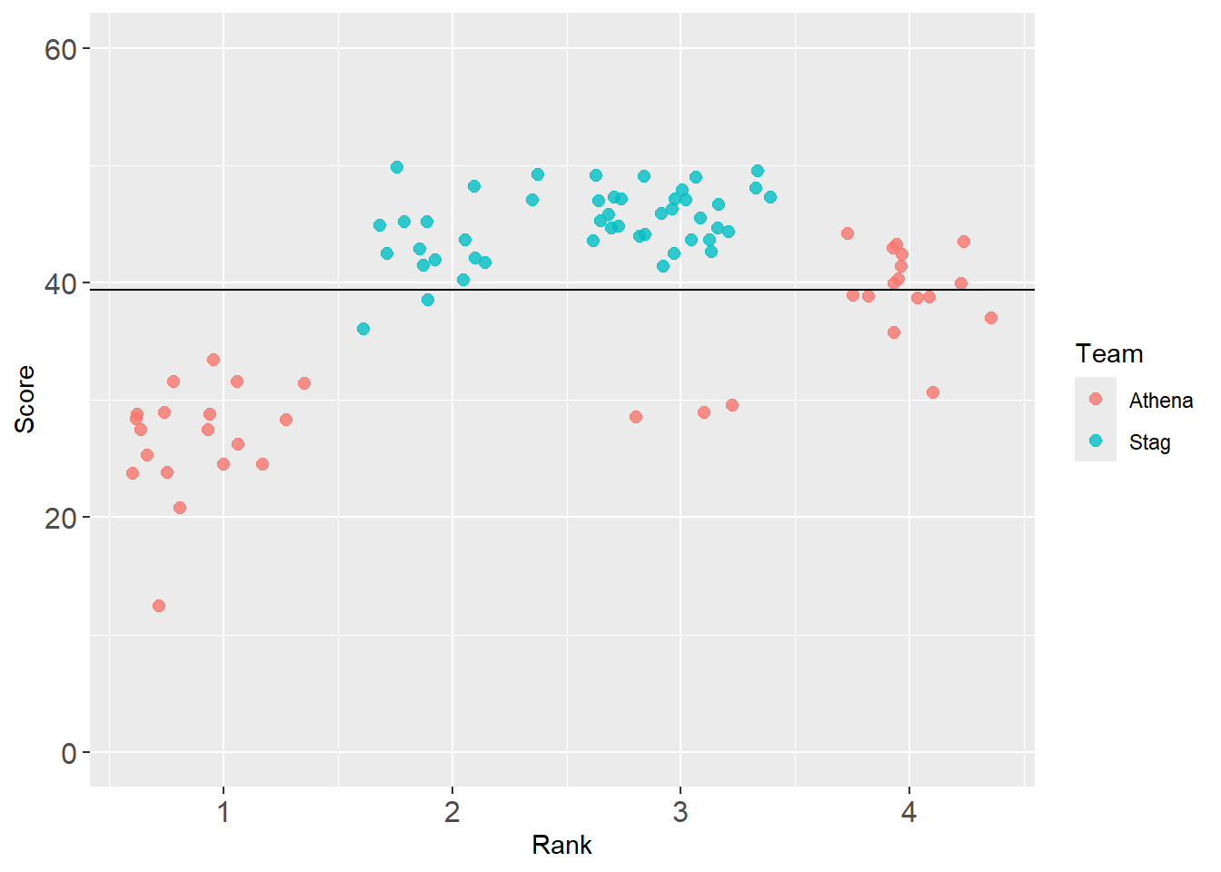
Let’s add a label easily using {geomtextpath}:
base_plot +
  geomtextpath::geom_texthline(yintercept = mean_y_2019,
                               label = "2019 average",
                               alpha = .5
                               )
Warning in geomtextpath::geom_texthline(yintercept = mean_y_2019, label = "2019 average", : All aesthetics have length 1, but the data has 85 rows.
ℹ Please consider using `annotate()` or provide this layer with data containing
a single row.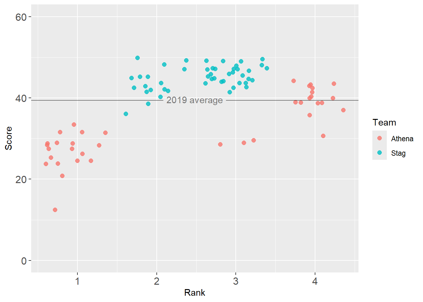
Notice, we are only specifying a place for all athletes rather than for Stags and Athenas separately.
Adding reference point with annotation
annotate(geom = "point")
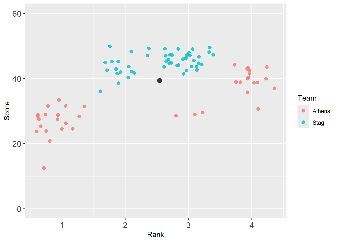
Use annotate() to plot a point to highlight some element using geom = "point".
base_plot +
  annotate(geom = "point",
           col = "grey20",
           x = mean_xy_2019$Rank,
           y = mean_xy_2019$Score,
           size = 3
  )
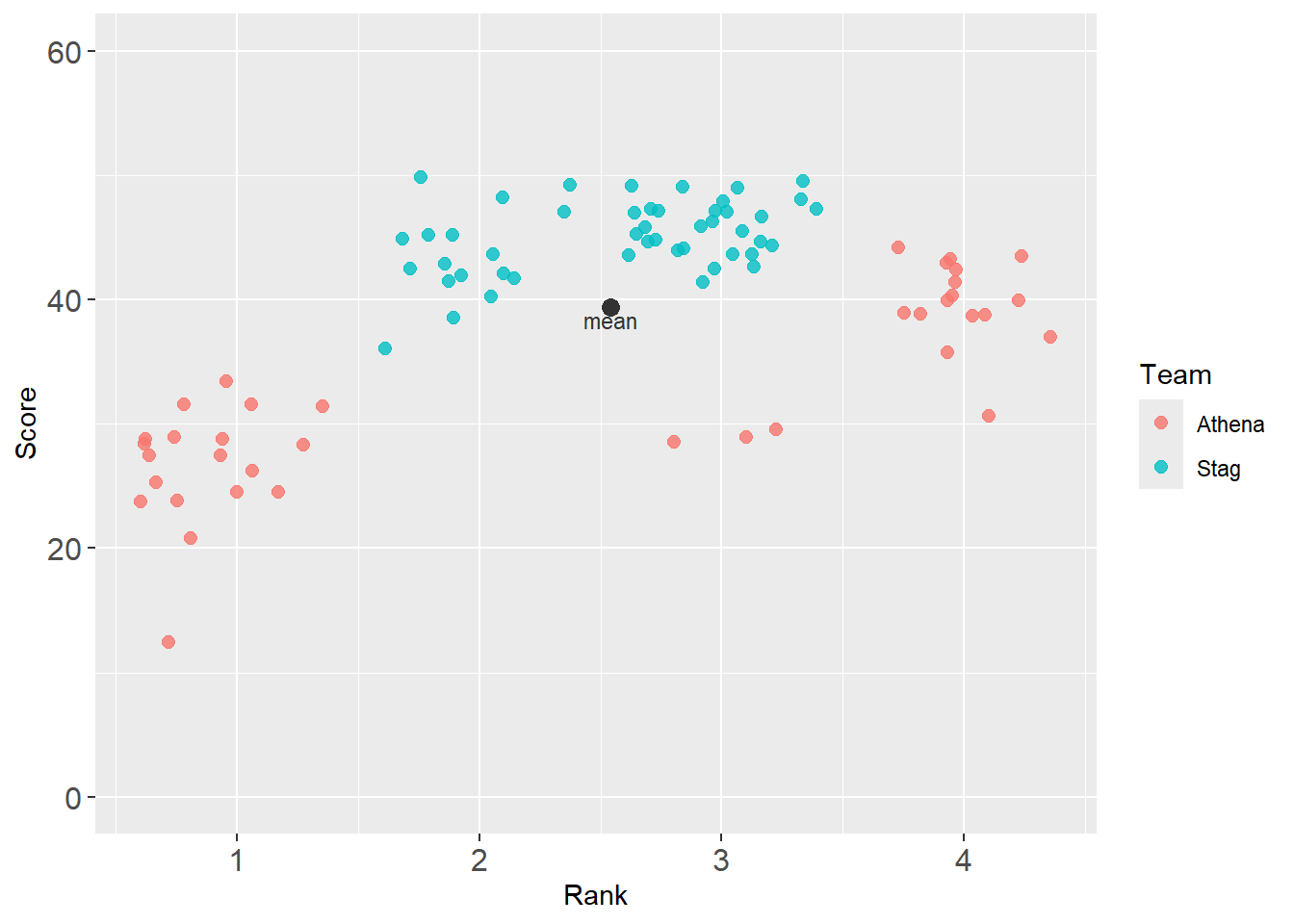
annotate(geom = "point") and annotate(geom = "text")
base_plot +
  annotate(geom = "point",
           col = "grey20",
           x = mean_xy_2019$Rank,
           y = mean_xy_2019$Score,
           size = 3
  ) +
  annotate(geom = "text",
           col = "grey20",
           x = mean_xy_2019$Rank,
           y = mean_xy_2019$Score - 1,
           label = "mean",
           size = 3
  )
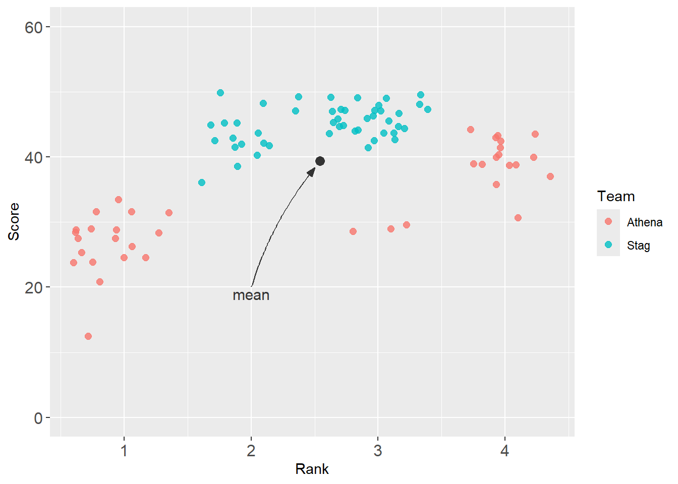
geom_curve() with arrow()
Direct attention with annotation and an arrow.
base_plot +
  annotate(geom = "point",
           col = "grey20",
           x = mean_xy_2019$Rank,
           y = mean_xy_2019$Score,
           size = 3
  ) +
  annotate(geom = "text",
           col = "grey20",
           x = mean_xy_2019$Rank,
           y = mean_xy_2019$Score - 1,
           label = "mean",
           size = 3
  ) +
  geom_curve(x = mean_xy_2019$Rank,                 # where the curve begins
             y = mean_xy_2019$Score,
             xend = mean_xy_2019$Rank + .2,          # where the curve ends
             yend = mean_xy_2019$Score + 2,
             color = "grey20",
             arrow = arrow(angle = 20,              # angle of the arrow
                           length = unit(0.25,"cm"),
                           ends = "first",          # "last", "first", or "both"
                           type = "closed"          # "open" or "closed" triangle
                           ),
             curvature = 1                        # the amount of curvature (0 is a line, not a curve)
) 
But the arrow point is overlapping the mean point. Let’s back off. Also, if you won’t be getting new data, you can set the coordinates to static values. This plot reflects a series of edits.
base_plot +
  annotate(geom = "point",
           col = "grey20",
           x = mean_xy_2019$Rank,
           y = mean_xy_2019$Score,
           size = 3
  ) +
  annotate(geom = "text",
           col = "grey20",
           x = 2,
           y = 19,
           label = "mean",
           size = 4
  ) +
  geom_curve(x = mean_xy_2019$Rank - .04,           # where the curve begins
             y = mean_xy_2019$Score - 1,
             xend = 2,                              # where the curve ends
             yend = 20,
             color = "grey20",
             arrow = arrow(angle = 20,              # angle of the arrow
                           length = unit(0.25,"cm"),
                           ends = "first",          # "last", "first", or "both"
                           type = "closed"          # "open" or "closed" triangle
                           ),
             curvature = 0.1                        # the amount of curvature (0 is a line, not a curve)
) 
geomtextpath::geom_textcurve()
Direct attention with annotation along the line.
base_plot +
  annotate(geom = "point",
           col = "grey20",
           x = mean_xy_2019$Rank,
           y = mean_xy_2019$Score,
           size = 3
  ) +
  geomtextpath::geom_textcurve(
    x = mean_xy_2019$Rank - .04,
    y = mean_xy_2019$Score - 1,
    xend = 2,
    yend = 20,
    curvature = .1,
    hjust = .5,                                      # label at start (1), end (0), or other (.5 = center)
    vjust = 0,
    col = "black",
    arrow = arrow(ends = "first"),
    label = "mean"                                   # label required (this replaces annotate() layer)
  )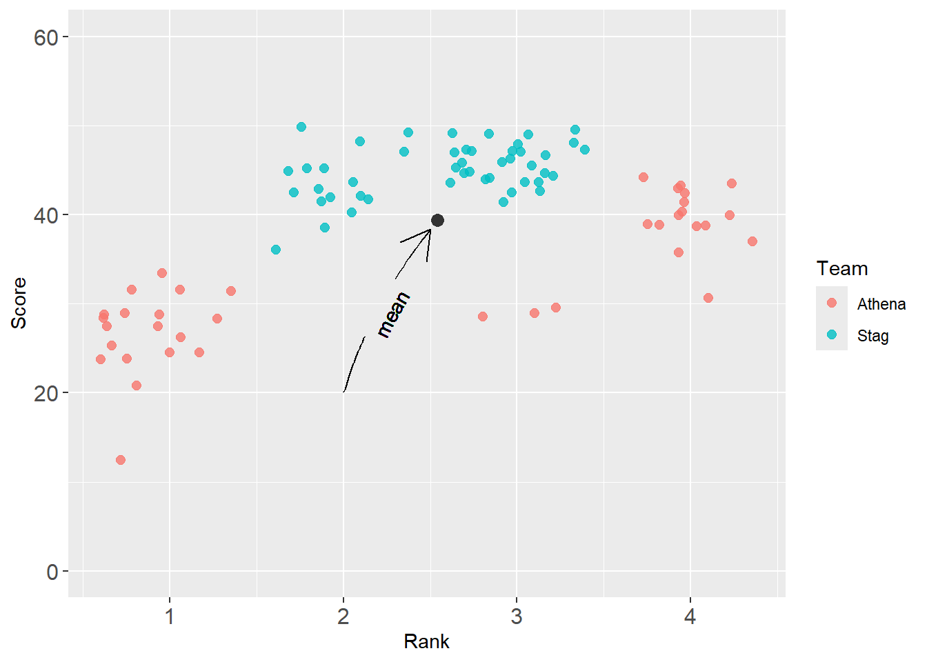
Warning: If your label is too long, fore example "overall mean", R will throw an error.
Error: Cannot create zero-length unit vector ("unit" subsetting)
Defining an arrow()
Let’s make an arrow to reuse. The default is ugly.
my_arrow <- arrow(angle = 20,
                  length = unit(0.25,"cm"),
                  ends = "first",
                  type = "closed"
                  )
You can change the font size to a smaller value, for example, size = 2.
base_plot +
  annotate(geom = "point",
           col = "grey20",
           x = mean_xy_2019$Rank,
           y = mean_xy_2019$Score,
           size = 3
  ) +
  geomtextpath::geom_textcurve(
    x = mean_xy_2019$Rank - .04,
    y = mean_xy_2019$Score - 1,
    size = 2,
    xend = 2,
    yend = 20,
    curvature = .1,
    hjust = .5,                                      # label at start (1), end (0), or other (.5 = center)
    vjust = 0,
    col = "black",
    arrow = my_arrow,
    label = "overall mean"                                      # label required (this replaces annotate() layer)
  )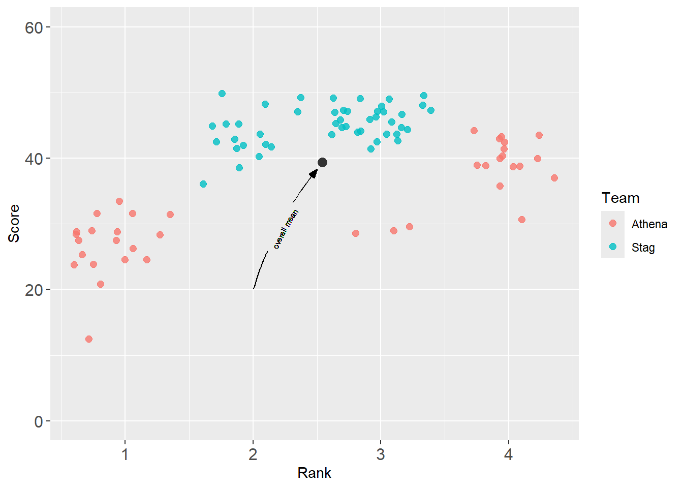
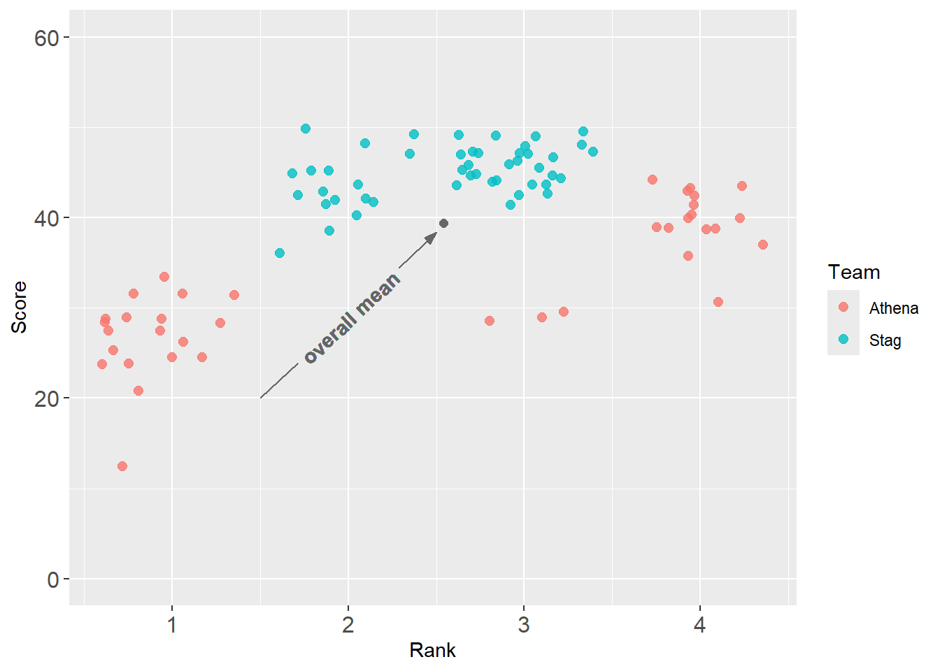
OK, too small. You can also change the length to the curve or line by changing xend and yend. Also, accepting the default justification serves you well enough, so let’s comment out.
base_plot +
  annotate(geom = "point",
           col = "grey40",
           x = mean_xy_2019$Rank,
           y = mean_xy_2019$Score,
           size = 2
  ) +
  geomtextpath::geom_textcurve(
    x = mean_xy_2019$Rank - .04,
    y = mean_xy_2019$Score - 1,
    #size = 2,
    xend = 1.5,
    yend = 20,
    curvature = 0,
#    hjust = .5,                                      # label at start (1), end (0), or other (.5 = center)
#    vjust = 0,
    col = "grey40",
    arrow = my_arrow,
    fontface = "bold",
    label = "overall mean"                                      # label required (this replaces annotate() layer)
  )
geomtextpath::geom_textcurve() with a new data frame
In the previous example, we set the coordinates from outside of aes(). This was done to show you that you could control the coordinates manually. In this example, we will take a new data frame and set data = best_2019. We will map x and y and then set xmin and ymin either because they do not exist in the data frame or because we just don’t want to map them.
DATA |>
  filter(Year == 2019) |>
  ggplot(mapping = aes(x = Rank,
                       y = Score,
                       col = Team
                       )
         ) +
  geom_point(size = 2.2,
             alpha = .75,
             position = position_jitter(height = 0, width = .1, seed = 167)
             ) +
  ylim(0, 60) +
  theme(axis.text.x = element_text(size = 12),  # x-axis size
        axis.text.y = element_text(size = 12)   # y-axis size
        ) +
  geomtextpath::geom_textcurve(
    data = best_2019,                           # the data frame with the best athlete
    mapping = aes(x = Rank,
                  y = Score,
                  label = paste(Score, Athlete, sep = "m  ")
                  ),
    xend = 3.5,
    yend = 60,
    size = 3,
    curvature = -.1,
    arrow = my_arrow,
    col = "black"
  )
Note: With {geomtextpath} text objects, if you receive the following error: Error: Cannot create zero-length unit vector ("unit" subsetting), this may reflect that your plot space in RStudio is too small to render the object correctly. Your code may not be in error. Simply increase the size of your plot space environment in RStudio.
geomtextpath::geom_labelcurve()
Same thing using geomtextpath::geom_labelcurve().
DATA |>
  filter(Year == 2019) |>
  ggplot(mapping = aes(x = Rank,
                       y = Score,
                       col = Team
                       )
         ) +
  geom_point(size = 2.2,
             alpha = .75,
             position = position_jitter(height = 0, width = .1, seed = 167)
             ) +
  ylim(0, 60) +
  theme(axis.text.x = element_text(size = 12),  # x-axis size
        axis.text.y = element_text(size = 12)   # y-axis size
        ) +
  geomtextpath::geom_labelcurve(
    data = best_2019,                             # the data frame with the best athlete
    mapping = aes(x = Rank,
                  y = Score,
                  label = paste(Score, Athlete, sep = "m  ")
                  ),
    xend = 3.5,
    yend = 60,
    size = 3,
    curvature = -.1,
    arrow = my_arrow,
    col = "black",
  )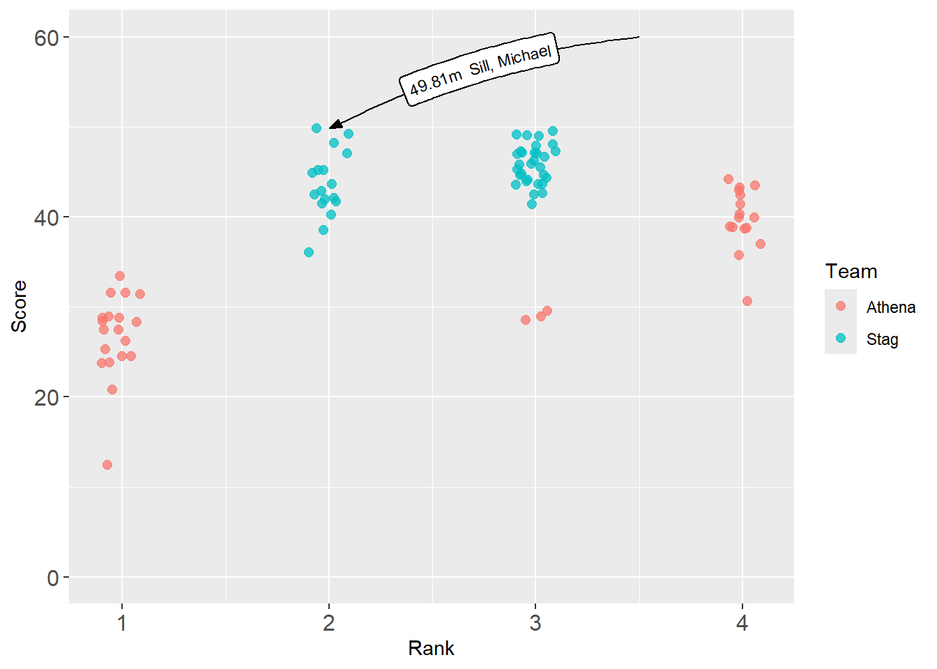
One issue with geom_textcurve() and geom_labelcurve() is the difficulty controlling the size of the content and the length of the line.
geomtextpath::geom_textline()
DATA |>
  filter(Year == 2019) |>
  ggplot(mapping = aes(x = Rank,
                       y = Score,
                       col = Team
                       )
         ) +
  geom_point(size = 2.2,
             alpha = .75,
             position = position_jitter(height = 0, width = .1, seed = 167)
             ) +
  ylim(0, 60) +
  theme(axis.text.x = element_text(size = 12),  # x-axis size
        axis.text.y = element_text(size = 12)   # y-axis size
        ) +
  geomtextpath::geom_textline(
    data = best_2019,                             # the data frame with the best athlete
    mapping = aes(x = Rank,
                  y = Score,
                  label = paste(Score, Athlete, sep = "m  ")
                  ),
    size = 3,
    col = "black",
  )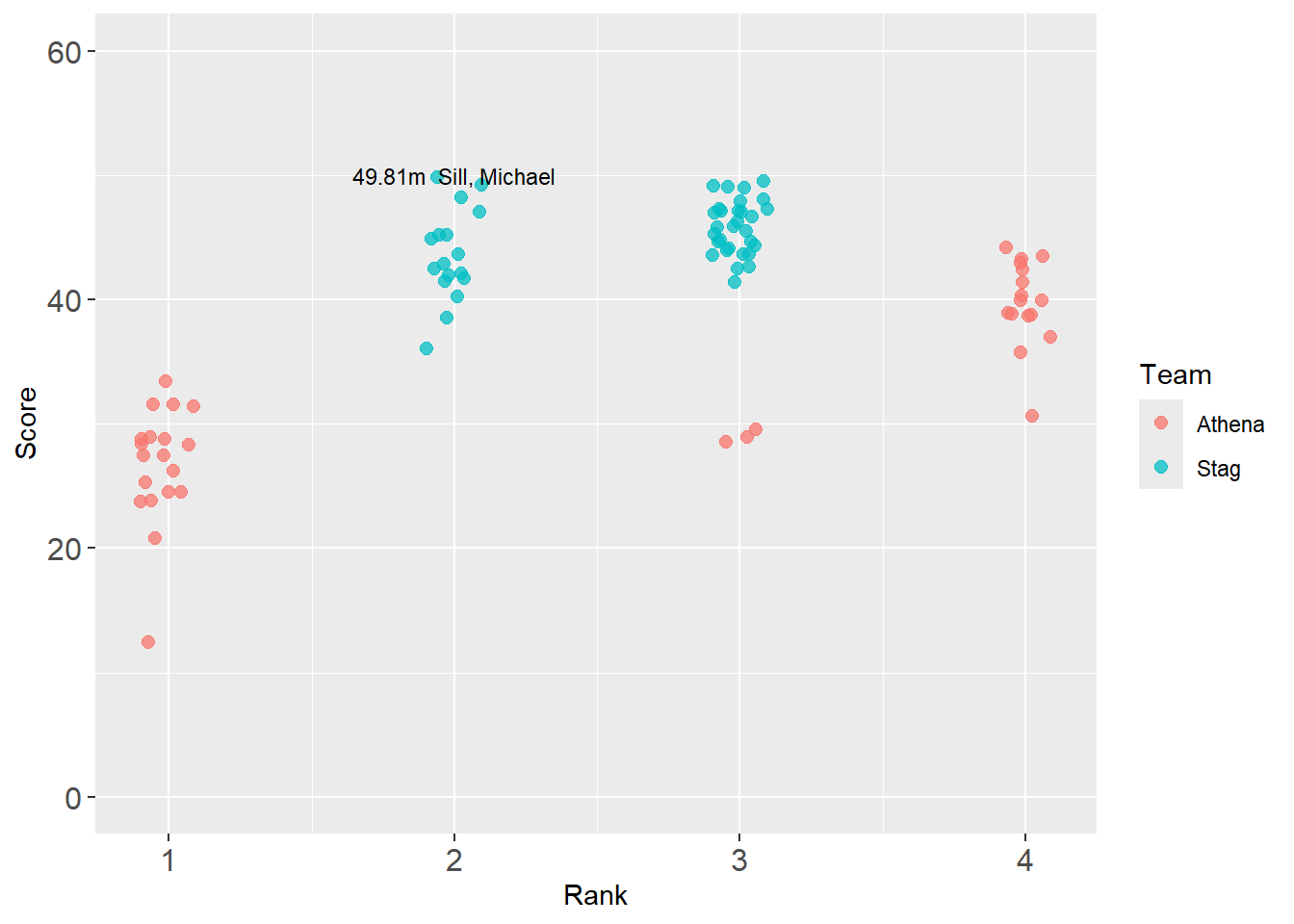
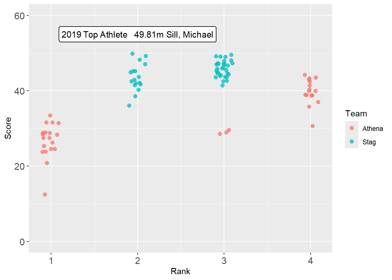
But the line is directly over the point. You can add values to x and y to move it. For example, aes(x = Score + 2, ...) but that might still look odd without an arrow. This adjustment is nevertheless made in the next example using geom_labelline().
geomtextpath::geom_labelline()
If you want to geomtextpath::geom_labelline():
DATA |>
  filter(Year == 2019) |>
  ggplot(mapping = aes(x = Rank,
                       y = Score,
                       col = Team
                       )
         ) +
  geom_point(size = 2.2,
             alpha = .75,
             position = position_jitter(height = 0, width = .1, seed = 167)
             ) +
  ylim(0, 60) +
  theme(axis.text.x = element_text(size = 12),  # x-axis size
        axis.text.y = element_text(size = 12)   # y-axis size
        ) +
  geomtextpath::geom_labelline(
    data = best_2019,                             # the data frame with the best athlete
    mapping = aes(x = Rank,
                  y = Score + 5,
                  label = paste(Year, " Top Athlete\n", Score, "m ", Athlete, sep = ""),
                  ),
    size = 4,
#    fontface = "bold",
    col = "black",
  )
Drawing attention to plot elements
If you need to draw attention to a particular group level, one way is to add colors as a vector in the data frame and then map that vector to an aesthetic. This example shows how to do this by fill but you can address with other aesthetics too.
Drawing attention to a bar
DATA |>
  filter(!is.na(Rank)) |>
  group_by(Rank) |>
  summarize(Score = mean(Score, na.rm = T)) |>
  mutate(Rank_Color = case_when(
    Rank == 1 ~ "goldenrod",
    Rank >  1 ~ "grey60",
    TRUE ~ "grey60"
    )) |>
  ggplot(mapping = aes(x = Rank,
                       y = Score,
                       fill = Rank_Color
                       )
         ) +
  geom_col() +
  scale_fill_identity()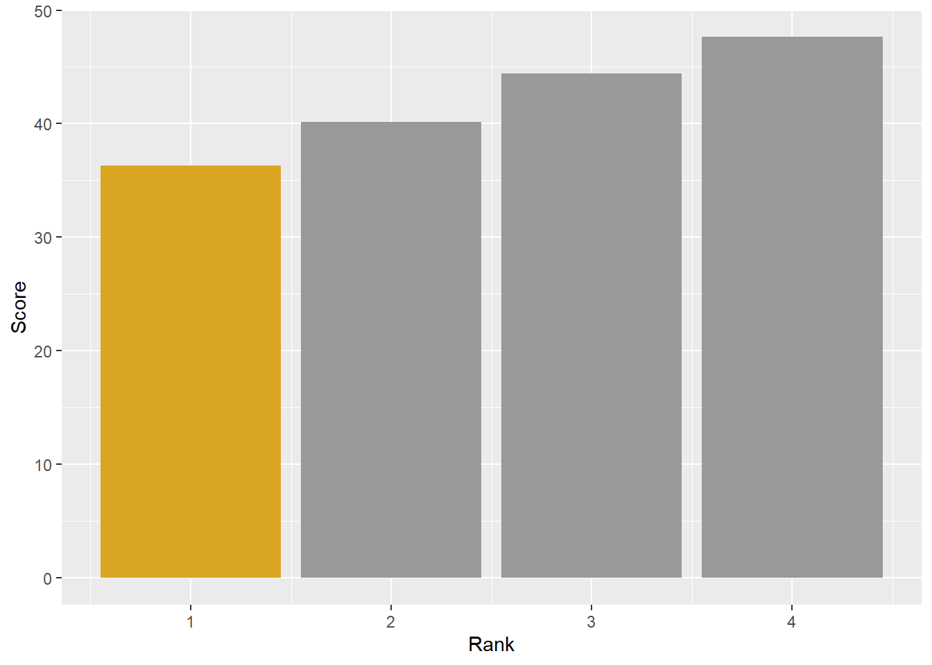
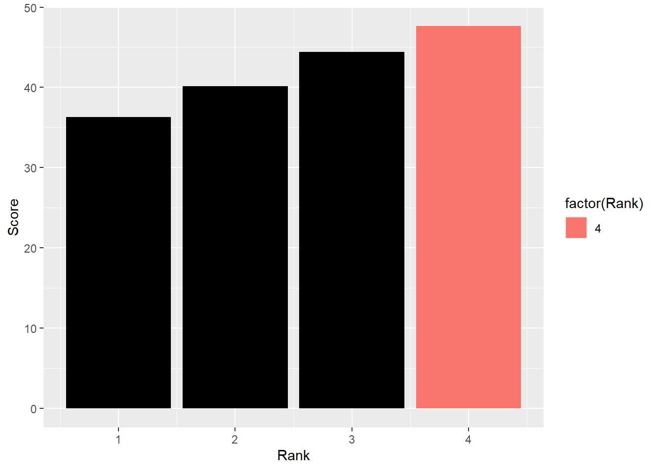
Drawing attention to a bar using {gghighlight}
DATA |>
  filter(!is.na(Rank)) |>
  group_by(Rank) |>
  summarize(Score = mean(Score, na.rm = T)) |>
  ungroup() |>
  ggplot(mapping = aes(x = Rank,
                       y = Score,
                       fill = factor(Rank)
                       )
         ) +
  geom_col() +
  gghighlight(Score > 45,
              unhighlighted_params = list(fill = "black")
              )
Fading out bars by mapping a variable to alpha
We will just adjust alpha in the data frame by the conditional.
DATA |>
  filter(!is.na(Rank)) |>
  group_by(Rank) |>
  summarize(Score = mean(Score, na.rm = T)) |>
  ungroup() |>
  mutate(
    cutoff = 41,
    Alpha = case_when(
      Score <= cutoff ~ .5,
      TRUE ~ 1
  )) |>
  ggplot(mapping = aes(x = Rank,
                       y = Score,
                       fill = factor(Rank),
                       alpha = Alpha
                       )
         ) +
  geom_col()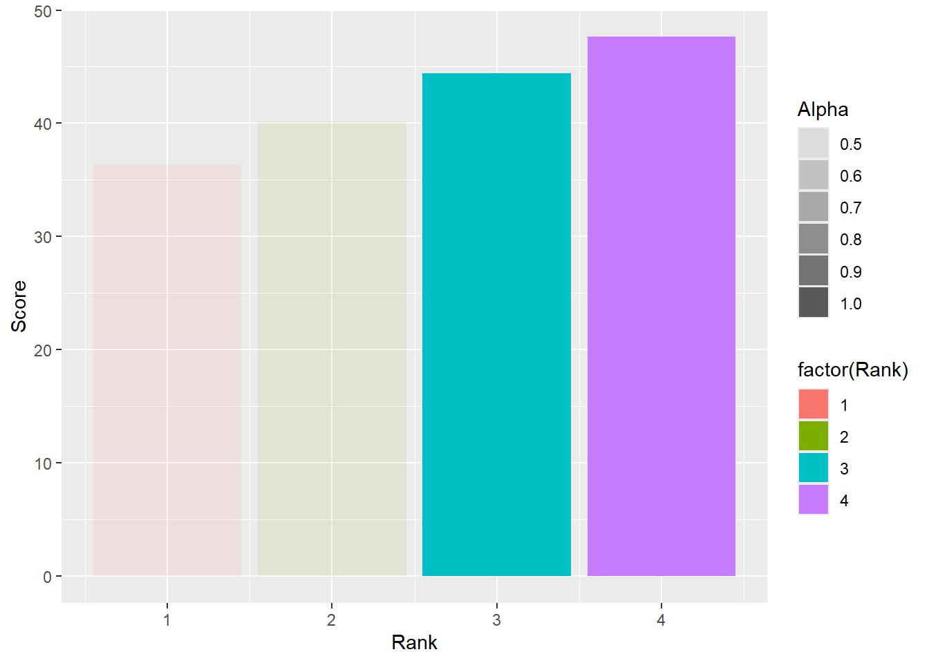
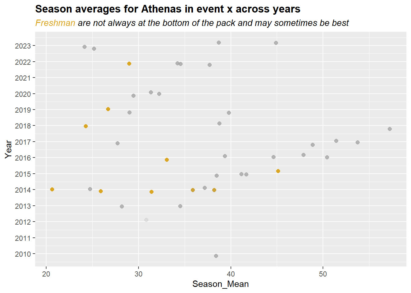
Drawing attention to points
Drawing attention to points can be accomplished in different ways. You may wish to color code certain points, change the alpha of certain points, make the shape distinctive, make the stroke thicker, etc. Much of this can be done by making variables directly in the data frame.
DATA |>
  mutate(Rank_Color = ifelse(Rank == 1,  "goldenrod", "black")) |>
  mutate(Rank_Color = case_when(
    Rank == 1 ~ "goldenrod",
    Rank >  1 ~ "grey60",
    TRUE ~ "grey60"
  )) |>
  mutate(Rank_Alpha = case_when(
    Rank == 1 ~ 1,
    Rank >  1 ~ .7,
    TRUE ~ .2
  )) |>
  filter(Team == "Athena") |>
  group_by(Year, Athlete) |>
  mutate(Season_Mean = mean(Score, na.rm = T), .groups = "keep") |>
  ungroup() |>
  select(-c(Meet, Date, Score, .groups)) |>
  distinct() |>
  ggplot(mapping = aes(x = Year,
                       y = Season_Mean,
                       col = Rank_Color,
                       alpha = Rank_Alpha
                       )
         ) +
  geom_point(size = 2,
             position = position_jitter(height = 0, width = .2, seed = 167),
             ) +
  scale_x_continuous(breaks = seq(2009, 2023, 1)) +
  coord_flip() +
  scale_color_identity() +
  scale_alpha_identity() +
  labs(title = "Season averages for Athenas in event x across years",
       subtitle = "<span style = 'color:goldenrod'>Freshman</span> are not always at the bottom of the pack and may sometimes be best") +
  theme(plot.title = element_markdown(face = "bold"),
        plot.subtitle = element_markdown(face = "italic"),
        )
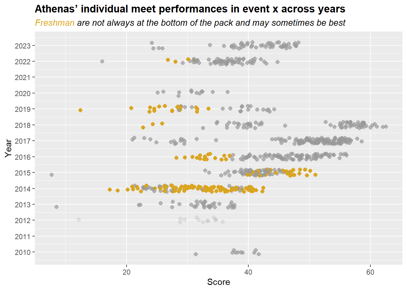
Similar plot with data from all meets:
DATA |>
  mutate(Rank_Color = ifelse(Rank == 1,  "goldenrod", "black")) |>
  mutate(Rank_Color = case_when(
    Rank == 1 ~ "goldenrod",
    Rank >  1 ~ "grey60",
    TRUE ~ "grey60"
  )) |>
  mutate(Rank_Alpha = case_when(
    Rank == 1 ~ 1,
    Rank >  1 ~ .7,
    TRUE ~ .2
  )) |>
  filter(Team == "Athena") |>
  ggplot(mapping = aes(x = Year,
                       y = Score,
                       col = Rank_Color,
                       alpha = Rank_Alpha
                       )
         ) +
  geom_point(size = 2,
             position = position_jitter(height = 0, width = .2, seed = 167),
             ) +
  scale_x_continuous(breaks = seq(2009, 2023, 1)) +
  coord_flip() +
  scale_color_identity() +
  scale_alpha_identity() +
  labs(title = "Athenas' individual meet performances in event x across years",
       subtitle = "<span style = 'color:goldenrod'>Freshman</span> are not always at the bottom of the pack and may sometimes be best") +
  theme(plot.title = element_markdown(face = "bold"),
        plot.subtitle = element_markdown(face = "italic"),
        )
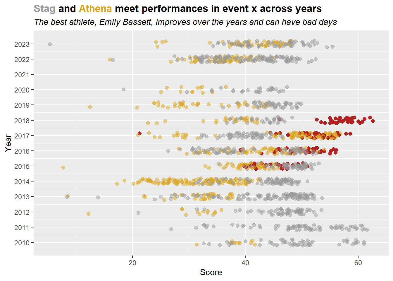
How about if you wanted to track the best performers over time. Or the single best athlete for an event.
Here is just a simple example for highlighting athletes by particular performance metric. Identify the names of the athletes who performed the best in any year (e.g., max()) and those to have the worst average (e.g., something like min(median(x)) because one could just have a flop as a minimum).
(best_names <- DATA |>
  group_by(Year, Team) |>
  slice_max(Score) |>
  ungroup()
)
# A tibble: 25 × 7
Athlete Rank Score Meet Date Team Year
<chr> <dbl> <dbl> <chr> <chr> <chr> <dbl>
1 Guang, Bonny 2 41.6 Cal Lu - CMS - La Verne - Wh… Mar … Athe… 2010
2 Berliant, Taylor 3 61.0 SCIAC Quad Meet Apr … Stag 2010
3 Berliant, Taylor 4 61.6 2011 NCAA Division III Outdo… May … Stag 2011
4 Kroll, Jackie NA 35.7 2012 Pomona-Pitzer T&F Invite Apr … Athe… 2012
5 Gage, Chris NA 53.4 Chapman/CMS/Pomona-Pitzer/Re… Mar … Stag 2012
6 Kroll, Jackie 2 37.7 SCIAC Quad Meet Apr … Athe… 2013
7 Hobbs, Nicholas 3 53.6 Oxy Invitational May … Stag 2013
8 Laliberte, Nicole 1 42.4 SCIAC Multi Duals Meet #3 Apr … Athe… 2014
9 Rich, Alex 2 51.0 2014 Pomona-Pitzer T&F All C… Feb … Stag 2014
10 Bassett, Emily 1 51.0 Pomona-Pitzer/Whittier/La Ve… Mar … Athe… 2015
# ℹ 15 more rowsThen get the best athlete and highlight points along with a label using repelled text.
# get the best performance
best_athlete <- best_names |> slice_max(Score)

# OK, use regular expression to rearrange the name
best_athlete_clean <- stringr::str_replace(best_athlete$Athlete, "^(\\w+),\\s(\\w+)", "\\2 \\1")

# make title using the name
plot_title <- paste0("<span style = 'color:grey60'>Stag</span> and <span style = 'color:goldenrod'>Athena</span> meet performances in event x across years")

plot_subtitle <- paste0("The best athlete, ", best_athlete_clean,
                        ", improves over the years and can have bad days"
                        )

# then plot
DATA |>
  mutate(Point_Color = case_when(
    Team == "Stag"   & Athlete != best_athlete$Athlete ~ "grey60",
    Team == "Stag"   & Athlete == best_athlete$Athlete ~ "firebrick",
    Team == "Athena" & Athlete != best_athlete$Athlete ~ "goldenrod",
    Team == "Athena" & Athlete == best_athlete$Athlete ~ "firebrick",
  )) |>
  mutate(Point_Alpha = case_when(
    Athlete == best_athlete$Athlete ~ 1,
    TRUE ~ .5
  )) |>
  ggplot(mapping = aes(x = Year,
                       y = Score,
                       col = Point_Color,
                       alpha = Point_Alpha
                       )
         ) +
  geom_point(size = 2,
             position = position_jitter(height = 0, width = .2, seed = 167),
             ) +
  scale_x_continuous(breaks = seq(2009, 2023, 1)) +
  coord_flip() +
  # add the identity aesthetics
  scale_color_identity() +
  scale_alpha_identity() +
  # add the titles
  labs(title = plot_title,
       subtitle = plot_subtitle
       ) +
  # render as html
  theme(plot.title = element_markdown(face = "bold"),
        plot.subtitle = element_markdown(face = "italic"),
        ) +
  # using the best athlete, plot label
  ggrepel::geom_text_repel(data = best_athlete,
                           mapping = aes(x = Year,
                                         label = Athlete
                                         ),
                           size = 3.5,
                           col = "firebrick",
                           alpha = 1,
                           fontface = "bold",
                           box.padding = 1,
                           hjust = 1,
                           vjust = 1,
                           segment.colour = "firebrick"
  )
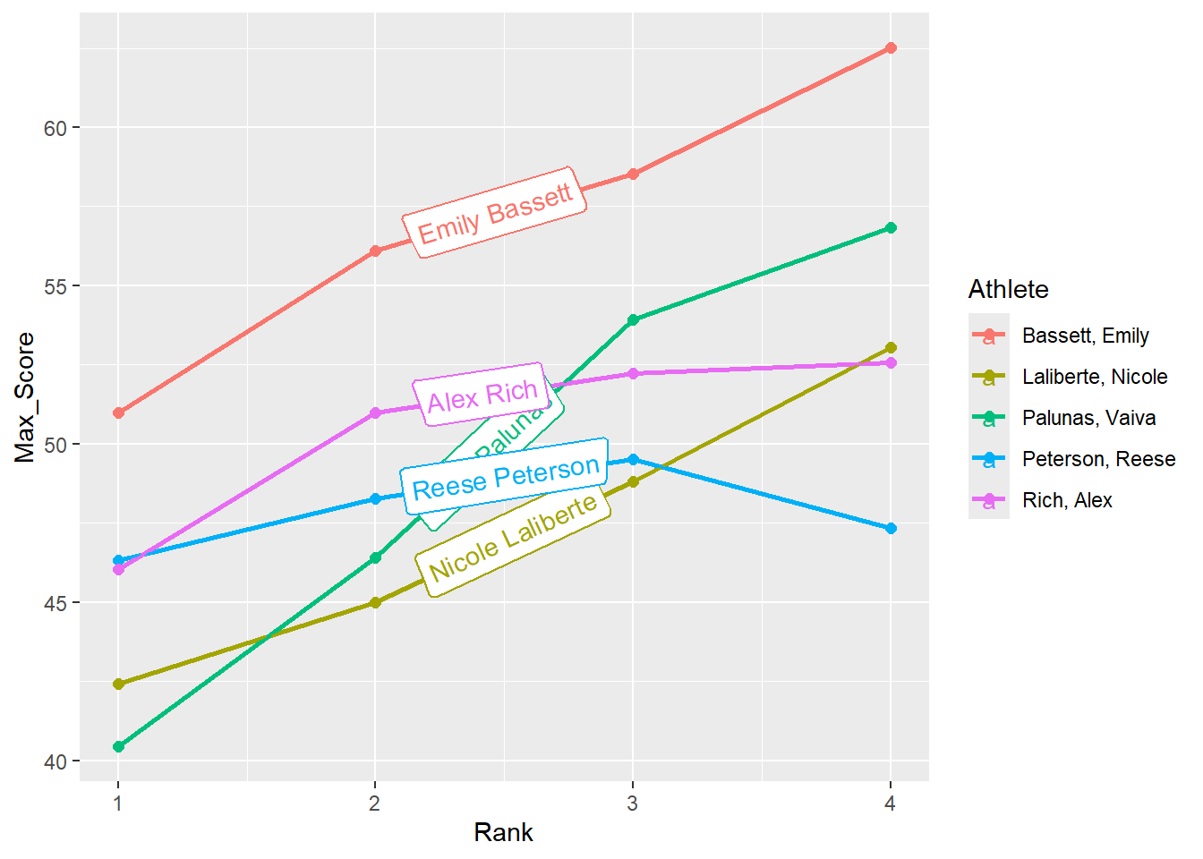
Highlighting lines
You can use geomtextpath::geom_labelline() to label lines. In this example, we label lines with athlete names. Specifically, we will group and obtain best scores for each athlete’s participating year then get the count for rows and filter for athletes who participated in all 4 years.
group_by(Athlete, Rank) |>
summarize(Max_Score = max(Score), .groups = "keep") |>
group_by(Athlete) |>
mutate(Count = n()) |>
filter(Count == 4)
DATA |>
filter(!is.na(Rank)) |>
mutate(Point_Color = case_when(
Team == "Stag" ~ "grey60",
Team == "Athena" ~ "goldenrod",
)) |>
group_by(Athlete, Rank) |>
summarize(Max_Score = max(Score), .groups = "keep") |>
group_by(Athlete) |>
mutate(Count = n()) |>
filter(Count == 4) |>
ggplot(mapping = aes(x = Rank,
y = Max_Score,
col = Athlete
)
) +
geom_point(size = 2) +
geom_line(linewidth = 1) +
geomtextpath::geom_labelline(
mapping = aes(label = stringr::str_replace(
Athlete, "^(\\w+),\\s(\\w+)", "\\2 \\1")
))
Highlighting with {gghighlight}
Clearly, the legend is no longer needed so that could be removed. Also, the name labels are a bit of a mess. One approach is to use {gghighlight} and gghighlight::gghighlight() which by default will move the labels.
DATA |>
  filter(!is.na(Rank)) |>
  mutate(Point_Color = case_when(
    Team == "Stag" ~ "grey60",
    Team == "Athena" ~ "goldenrod",
  )) |>
  group_by(Athlete, Rank) |>
  summarize(Max_Score = max(Score), .groups = "keep") |>
  group_by(Athlete) |>
  mutate(Count = n()) |>
  filter(Count == 4) |>
  ggplot(mapping = aes(x = Rank,
                       y = Max_Score,
                       col = Athlete
                       )
         ) +
  geom_point(size = 2) +
  geom_line(linewidth = 1) +
  gghighlight::gghighlight()
label_key: Athlete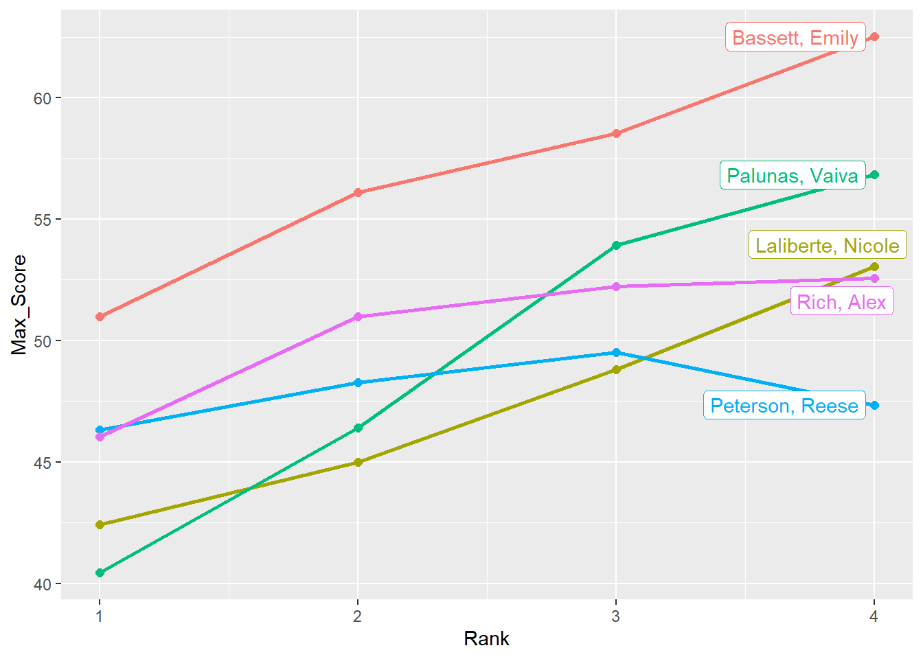
Highlighting specific data with {gghighlight}
gghighlight::gghighlight() will take expressions for filtering the data. We can highlight subsets of the data based on a function we pass.
For example, mean(Mean_Score) > 45 will highlight lines for which the condition is met.
gghighlight::gghighlight(mean(Mean_Score) > 45)
DATA |>
  filter(!is.na(Rank)) |>
  mutate(Point_Color = case_when(
    Team == "Stag" ~ "grey60",
    Team == "Athena" ~ "goldenrod",
  )) |>
  group_by(Athlete, Rank) |>
  summarize(Mean_Score = mean(Score),
            Max_Score = max(Score),
            .groups = "keep") |>
  group_by(Athlete) |>
  mutate(Count = n()) |>
  filter(Count == 4) |>
  ggplot(mapping = aes(x = Rank,
                       y = Max_Score,
                       col = Athlete
                       )
         ) +
  # add point plot
  geom_point(size = 2) +
  # add a line plot
  geom_line(linewidth = 1) +
  # highlight conditions met
  gghighlight::gghighlight(mean(Mean_Score) > 45) +
  labs(title = "My Title",
       subtitle = "Out of the 5 athletes who participated all college years, only two maintained an average higher than 45 across meets each year") +
  theme(plot.title = element_markdown(face = "bold"),
        plot.subtitle = element_markdown(face = "italic"),
        )
label_key: Athlete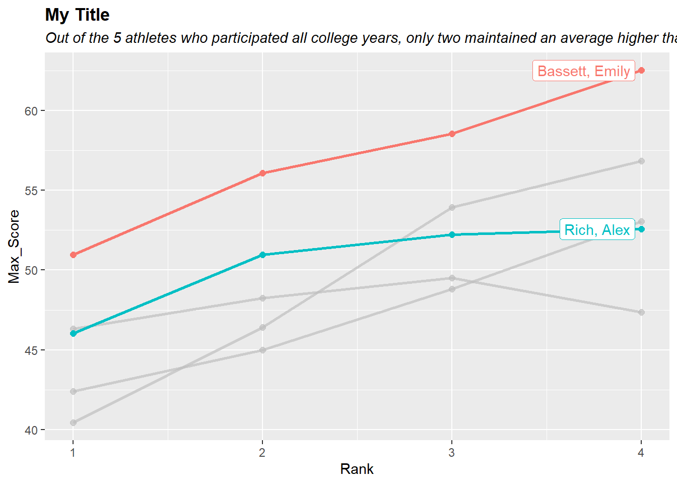
Drawing attention to a plot region
For various reasons, you may wish to draw attention to a particular region of a data visualization. Perhaps you want to highlight a time period of interest create an confidence interval band to frame out the data. We will address some ways you can do this using annotate() and geom_rect() but you could also apply other functions like geom_ribbon(), geom_tile(), or geom_polygon() in similar ways.
Highlighting a region using annotate()
Using geom = "text", you can annotate the plot with a rectangle to represent an area of interest. You can think of To draw a rectangle to highlight an area of interest in three useful ways.
- To highlight a vertical band stretching the entire y-axis, beginning and ending at x-axis locations.
- To highlight a horizontal band stretching the entire x-axis, beginning and ending y-axis locations.
- To highlight a rectangle, beginning and ending x-axis and y-axis locations
Bonus: You can create more than one of any of the preceding.
Highlighting a slice of the x-axis using annotate()
For this, we will specify:
xmin: beginning point of xxmax: ending point of xymin: beginning point of y
ymax: ending point of yfill: the color inside the rectanglealpha: the alpha of the fill color inside the rectanglecol: the line border of the rectanglelinewidth: the line thickness of the borderlinetype: the type of the line border
DATA |>
  filter(!is.na(Rank)) |>
  ggplot(mapping = aes(x = Year,
                       y = Score
                       )
         ) +
  # add point plot
  geom_point(size = 2,
             alpha = .3,
             position = position_jitter(height = 0, width = .25, seed = 167)
  ) +
  scale_x_continuous(breaks = seq(2010, 2023, 1)) +
  # make the rectangle
  annotate(geom = "rect",
           xmin = 2012.5,            # beginning point of x
           xmax = 2013.5,            # ending point of x
           ymin = -Inf,              # make the rectangle extend along y
           ymax = Inf,               # make the rectangle extend along y
           fill = "goldenrod",       # the color inside the rectangle
           alpha = 0.25,             # the alpha of the fill color inside the rectangle
           col = "black",            # the line border of the rectangle
           linewidth = .5,           # the line thickness of the border
           linetype = "solid"        # the type of the line border
           ) +
  theme_classic()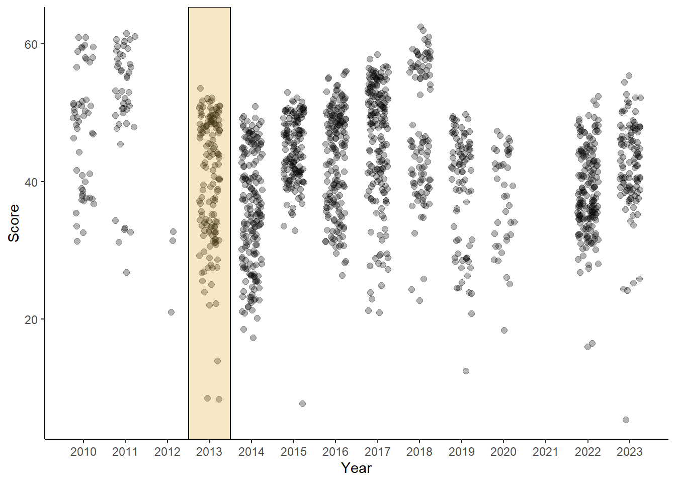
Highlighting a slice of the y-axis using annotate()
Some elements of the rectangle are removed here and the annotate() layer is added before the points to remind you that layers build on top of each other. Even with transparency of the fill of the rectangle, adding the layer after previous geoms (points in this instance) will result in a visualization that creates the perception of the rectangle covering, and thus, adding color to, the points behind it. If you wish the highlighted region to fade into the background and allow the points to float on top of the rectangle, make sure that your layer order achieves that goal.
DATA |>
  filter(!is.na(Rank)) |>
  ggplot(mapping = aes(x = Year,
                       y = Score
                       )
         ) +
  # make the rectangle
  annotate(geom = "rect",
           xmin = -Inf,           # beginning point of x
           xmax = Inf,            # ending point of x
           ymin = 55,             # make the rectangle extend along y
           ymax = 65,             # make the rectangle extend along y
           fill = "goldenrod",    # the color inside the rectangle
           alpha = 0.25           # the alpha of the fill color inside the rectangle
           ) +
  # add point plot
  geom_point(size = 2,
             alpha = .3,
             position = position_jitter(height = 0, width = .25, seed = 167)
  ) +
  scale_x_continuous(breaks = seq(2010, 2023, 1)) +
  theme_classic()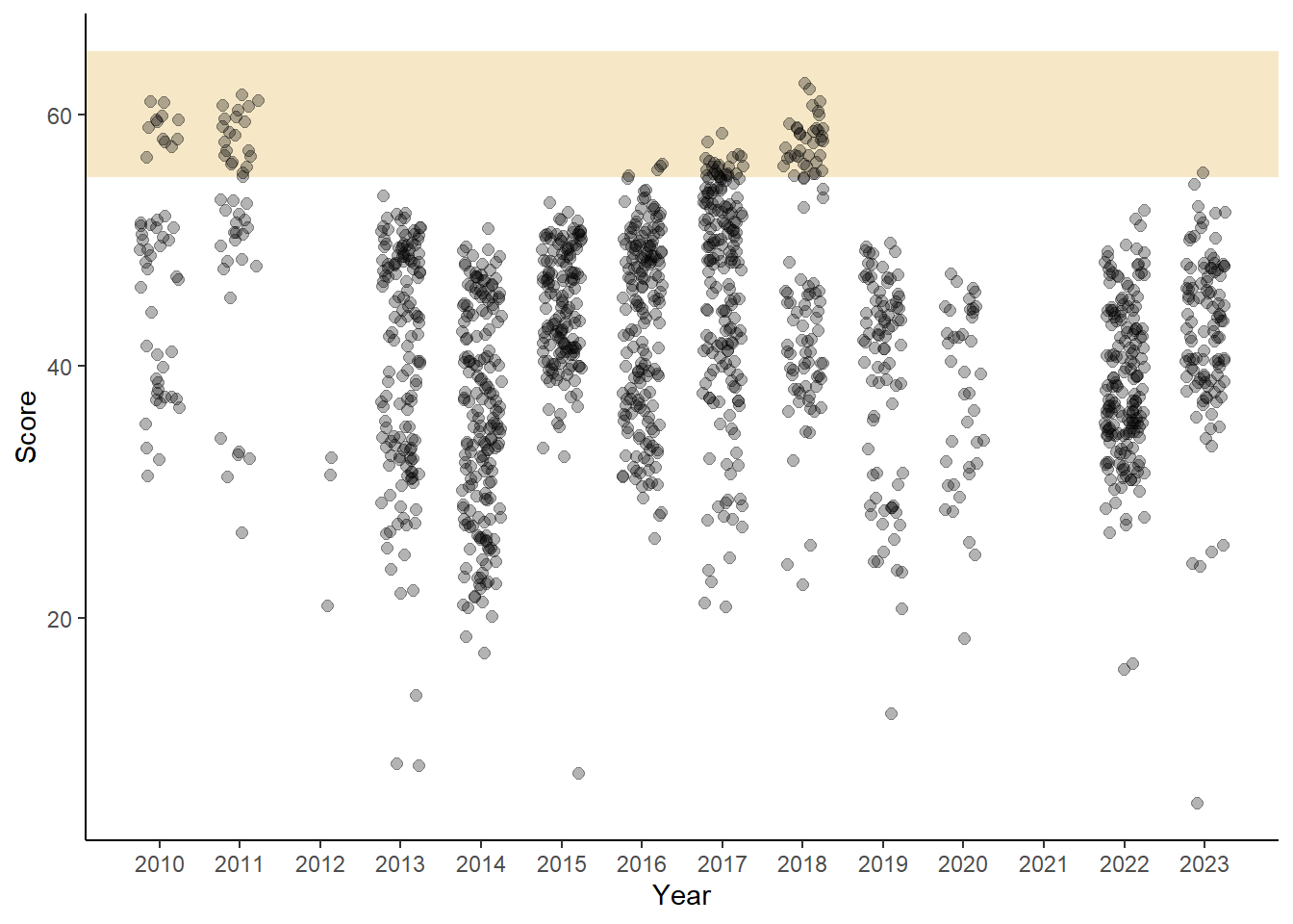
Highlighting a slice of the y-axis using geom_rect()
Using annotate() along with geom = "rect". However, you can certainly use geom_rect() to build a rectangle.
DATA |>
  filter(!is.na(Rank)) |>
  ggplot(mapping = aes(x = Year,
                       y = Score
                       )
         ) +
  # add the rectangle
  geom_rect(xmin = -Inf,
            xmax = Inf,
            ymin = 55,
            ymax = 65,
            fill = "goldenrod",
            alpha = .25,              # same alpha
            ) +
  # add point plot
  geom_point(size = 2,
             alpha = .3,
             position = position_jitter(height = 0, width = .25, seed = 167)
  ) +
  scale_x_continuous(breaks = seq(2010, 2023, 1)) +
  theme_classic()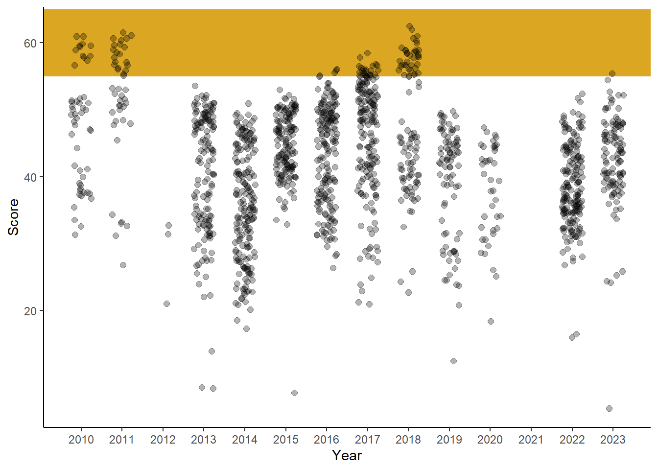
Notice the color differences. We will address this curiosity later.
Highlighting a rectangle using annotate()
When you have a rectangular area of interest, build an actual rectangle. We will also create a data summary based on a subset of athletes and years to obtain the 95% confidence interval for all performances during those years. There is no particular reason those this type of data but this could represent a significant time period.
DATA_CI95 <- DATA |>
  filter(Team == "Stag") |>             # get stag only
  filter(!is.na(Rank)) |>
  filter(Year %in% c(2016:2020)) |>
  summarize(xmin = min(Year),
            xmax = max(Year),
            ymin = mean(Score, na.rm = T) - (1.96 * sd(Score, na.rm = T)),
            ymax = mean(Score, na.rm = T) + (1.96 * sd(Score, na.rm = T)),
            )


DATA |>
  filter(Team == "Stag") |>
  filter(!is.na(Rank)) |>
  ggplot(mapping = aes(x = Year,
                       y = Score
                       )
         ) +
  # build the rectangle based on the subset summary
  annotate(geom = "rect",
           xmin = DATA_CI95$xmin - .5, # add a buffer to highlight the jittered points
           xmax = DATA_CI95$xmax + .5, # add a buffer to highlight the jittered points
           ymin = DATA_CI95$ymin,
           ymax = DATA_CI95$ymax,
           fill = "firebrick",
           alpha = .25,
           ) +
  # add point plot
  geom_point(size = 2,
             alpha = .3,
             position = position_jitter(height = 0, width = .25, seed = 167)
  ) +
  scale_x_continuous(breaks = seq(2010, 2023, 1))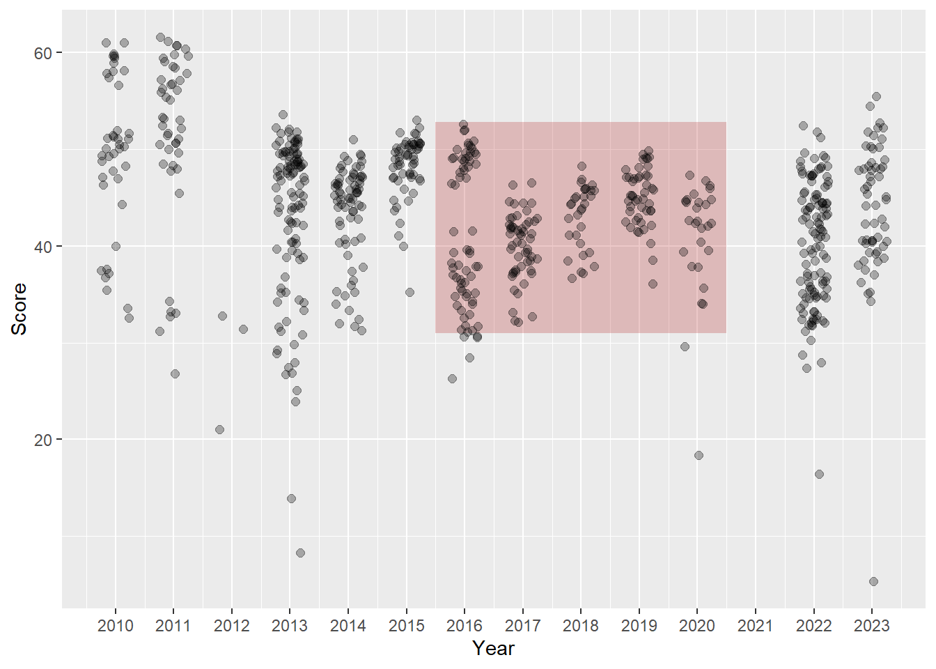
During this time period, you can see there are a few event performances (not athletes) outside this confidence section. However, in other years, there some performances that fall quite above that range.
Highlighting two slices of the x-axis using annotate()
Because Year and Score are mapped already, we can simply create these two variables in the data frame. If they are not in the data frame, you will get an error and need to troubleshoot. Adding them is a simple solution. As long as the variable type created is the same as the variable in the other data frame, you will be OK. In this instance, we can just add a numeric value that is within the plot coordinates. The mean will ensure this.
(DATA_topbottom <- DATA |>
  filter(Team == "Stag") |>             # get stag only
  filter(!is.na(Rank)) |>
  mutate(Decile = ntile(Score, 10)) |>
  group_by(Decile) |>
  summarize(xmin = -Inf,
            xmax = Inf,
            ymin = min(Score, na.rm = T),
            ymax = max(Score, na.rm = T),
            Year = mean(Year, na.rm = T),   # a numeric value needs to be added
            Score = mean(Score, na.rm = T)  # a numeric value needs to be added
            ) |>
  ungroup() |>
  filter(Decile %in% c(1,10))   # keep data in the top and bottom decile
)
# A tibble: 2 × 7
Decile xmin xmax ymin ymax Year Score
<int> <dbl> <dbl> <dbl> <dbl> <dbl> <dbl>
1 1 -Inf Inf 5.32 33.9 2017. 29.7
2 10 -Inf Inf 51.0 61.6 2013. 55.0We now have a data frame with two rows, one for the top decile and one for the bottom. Let’s add a geom_rect() and specify data = DATA_topbottom and then map the variables to the required aesthetics.
DATA |>
  filter(Team == "Stag") |>
  filter(!is.na(Rank)) |>
  ggplot(mapping = aes(x = Year,
                       y = Score
                       )
         ) +
  # build the rectangle based on new data
  geom_rect(data = DATA_topbottom,
            mapping = aes(xmin = xmin,
                          xmax = xmax,
                          ymin = ymin,
                          ymax = ymax,
                          fill = factor(Decile)
                          ),
            alpha = .2,
           ) +
  # add point plot
  geom_point(mapping = aes(col = factor(Year)),
             size = 2,
             alpha = .3,
             position = position_jitter(height = 0, width = .25, seed = 167)
  ) +
  scale_x_continuous(breaks = seq(2010, 2023, 1)) +
  coord_flip() +
  labs(x = NULL) +
  theme_classic() +
  theme(legend.position = "none")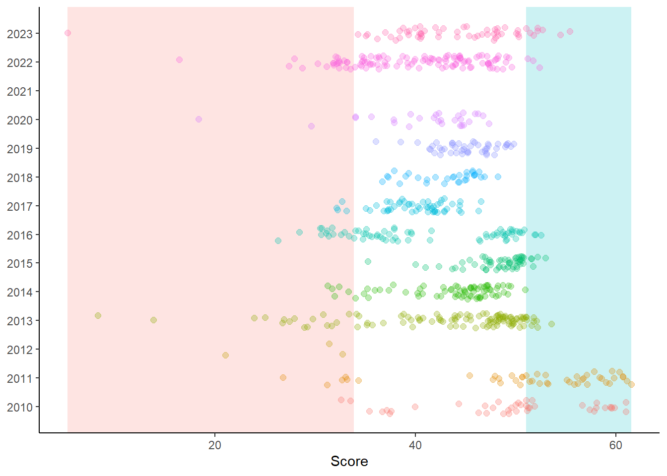
Removing the legend and instead either direct labeling the deciles or using color in the title to clarify them will help communicate the intent of these bands without the legend taking up so much real estate. And of course, you could add a color variable to the data frame and scale_color_identity() the color for the 1st and 10th decile. If you are already using color for the points, then coloring them would be challenging. You could use filled shapes and add a black color ring around them or change the stroke. But using a rectangle might serve a useful purpose. Whatever you do to draw attention to plot elements, ensure that your audience understands your intent.
Comparing annotate() versus geom_rect()
Why introduce you to both approaches if they can achieve the same outcome? Well, notice the difference between the rectangle added with annotate() and geom_rect() when the alpha is the same. Although alpha = .25 in both some instances, geom_rect() draws a darker rectangle.
Why? Remember that geoms will iterate for each row in the data frame. Because the variables are mapped to aesthetics in geom_rect(), the rectangle is built over and over again. You can experience this with the time required to build the plot when there are many rows. If you want more control over alpha, you might consider annotate().
Session Info
sessionInfo()R version 4.4.1 (2024-06-14 ucrt)
Platform: x86_64-w64-mingw32/x64
Running under: Windows 11 x64 (build 22631)
Matrix products: default
locale:
[1] LC_COLLATE=English_United States.utf8
[2] LC_CTYPE=English_United States.utf8
[3] LC_MONETARY=English_United States.utf8
[4] LC_NUMERIC=C
[5] LC_TIME=English_United States.utf8
time zone: America/Los_Angeles
tzcode source: internal
attached base packages:
[1] stats graphics grDevices utils datasets methods base
other attached packages:
[1] ggtext_0.1.2 gghighlight_0.4.1 geomtextpath_0.1.4 ggrepel_0.9.5
[5] magrittr_2.0.3 htmltools_0.5.8.1 DT_0.33 vroom_1.6.5
[9] lubridate_1.9.3 forcats_1.0.0 stringr_1.5.1 dplyr_1.1.4
[13] purrr_1.0.2 readr_2.1.5 tidyr_1.3.1 tibble_3.2.1
[17] ggplot2_3.5.1 tidyverse_2.0.0
loaded via a namespace (and not attached):
[1] tidyselect_1.2.1 Exact_3.2 rootSolve_1.8.2.4 farver_2.1.2
[5] R.utils_2.12.3 fastmap_1.2.0 digest_0.6.36 timechange_0.3.0
[9] lifecycle_1.0.4 lmom_3.0 compiler_4.4.1 rlang_1.1.4
[13] sass_0.4.9 tools_4.4.1 utf8_1.2.4 yaml_2.3.10
[17] data.table_1.15.4 knitr_1.47 labeling_0.4.3 htmlwidgets_1.6.4
[21] bit_4.0.5 here_1.0.1 xml2_1.3.6 expm_0.999-9
[25] withr_3.0.1 R.oo_1.26.0 grid_4.4.1 fansi_1.0.6
[29] e1071_1.7-14 colorspace_2.1-0 scales_1.3.0 MASS_7.3-60.2
[33] cli_3.6.3 mvtnorm_1.2-5 rmarkdown_2.27 crayon_1.5.3
[37] generics_0.1.3 rstudioapi_0.16.0 httr_1.4.7 tzdb_0.4.0
[41] commonmark_1.9.1 readxl_1.4.3 gld_2.6.6 cachem_1.1.0
[45] proxy_0.4-27 cellranger_1.1.0 vctrs_0.6.5 boot_1.3-30
[49] Matrix_1.7-0 jsonlite_1.8.8 hms_1.1.3 bit64_4.0.5
[53] systemfonts_1.1.0 crosstalk_1.2.1 jquerylib_0.1.4 glue_1.7.0
[57] stringi_1.8.4 gtable_0.3.5 munsell_0.5.1 pillar_1.9.0
[61] R6_2.5.1 textshaping_0.4.0 rprojroot_2.0.4 evaluate_0.24.0
[65] lattice_0.22-6 markdown_1.13 R.methodsS3_1.8.2 moments_0.14.1
[69] gridtext_0.1.5 bslib_0.8.0 DescTools_0.99.54 class_7.3-22
[73] Rcpp_1.0.12 xfun_0.45 pkgconfig_2.0.3